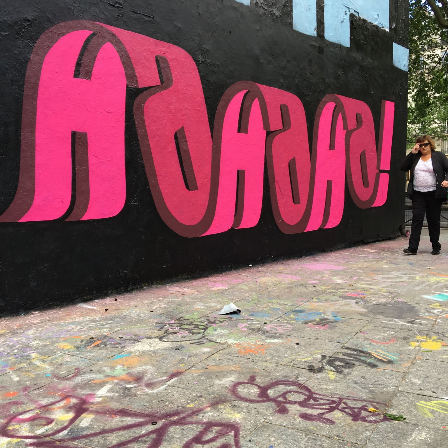
A word can have more meanings, so why not create a word that hides others within it?
This seems to be the question posed by Pref, the English street artist who has always worked with words looking for different methods to represent them.
His 3D texts play with letters to give a single piece of multiple perspectives.
At the beginning of his studies on typography, carried out with the aim of making the texts of his pieces more readable and accessible, the artist worked with negative space, today after years and years of career, the use of negative space and combined texts have become his stylistic figure.
“Since then I have pushed and experimented with this idea of overlapping words, seeing how many I can fit into the space of one word, and then slowly boiling it down and simplifying this idea to become more legible, this in turn lead more to the use of ‘typography’ throughout my style as you see today. I have always been interested in the idea of graffiti speaking to the general public, rather than just other graffiti writers, and readable letters or a more ‘typographic’ approach has been a good route to that.” – He recently told to Colossal.