Today Wikipedia turns 25, and what we feel when we open a page on the most famous free encyclopedia of all time is a kind of comfort that, in a way, makes us feel safe. With its slightly out-of-time aura and instantly recognizable layout, Wikipedia is a clear example of “visual safety”: an interface that changes very little, and precisely for that reason has become a point of reference. It’s not just nostalgia—it’s a very deliberate choice.
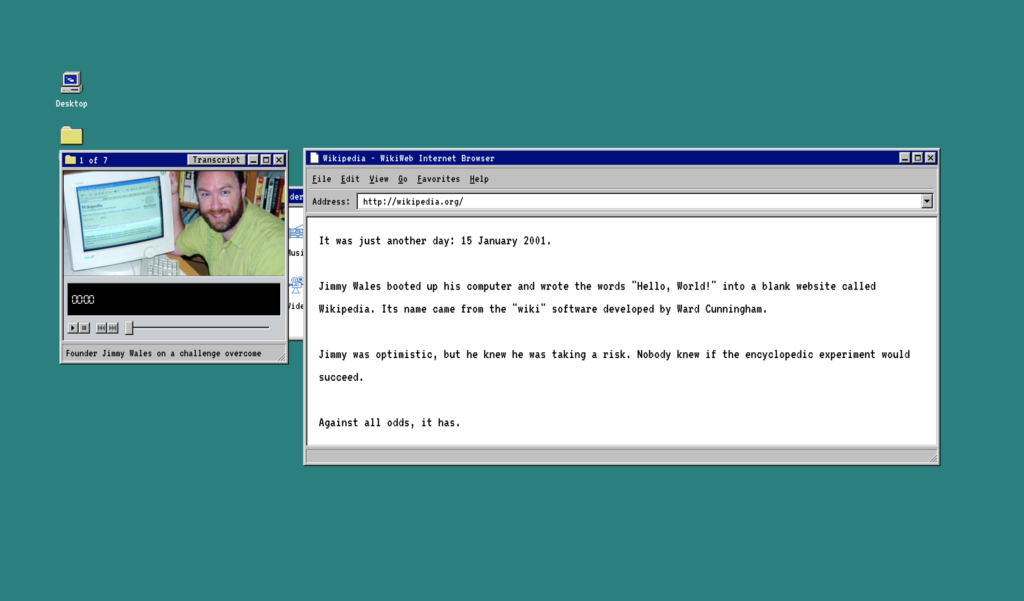
Behind that sense of stability, though, there isn’t only an aesthetic decision. Twenty-five years after it was born, Wikipedia remains one of the few major digital spaces built and maintained almost entirely by people: a global community of hundreds of thousands of volunteers who write, correct, and verify entries every day. And if today we deal daily with automatically generated content, Wikipedia’s sober interface ends up reflecting a precise idea of knowledge: human, verifiable, slow. Not perfect, but reliable.
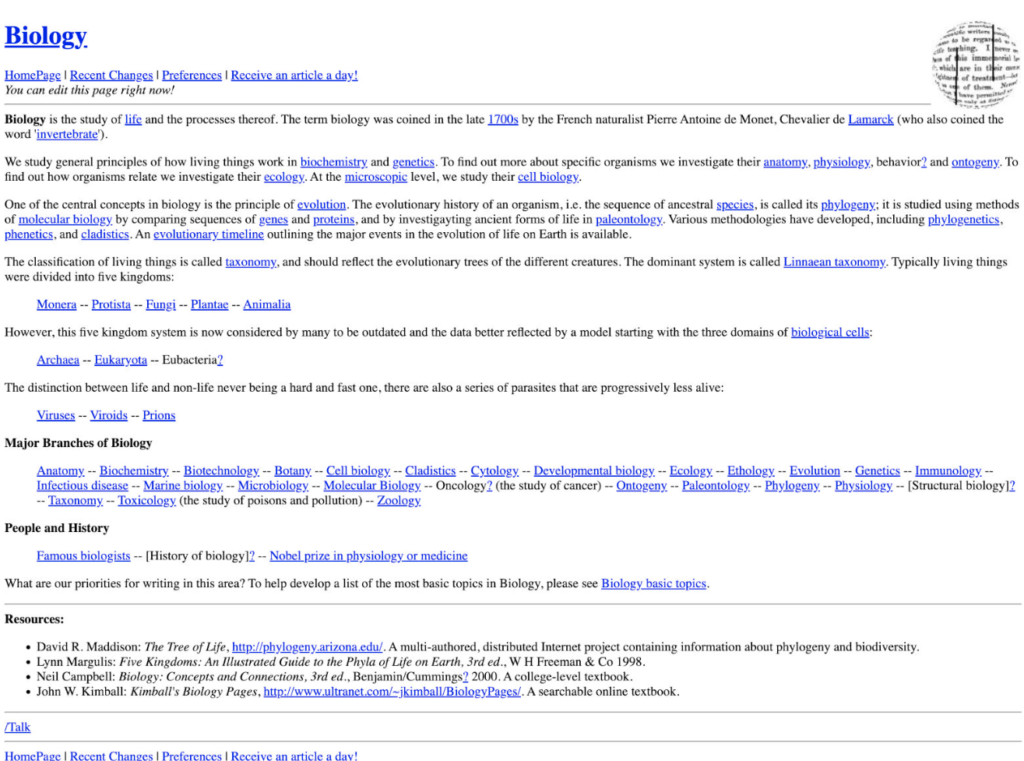
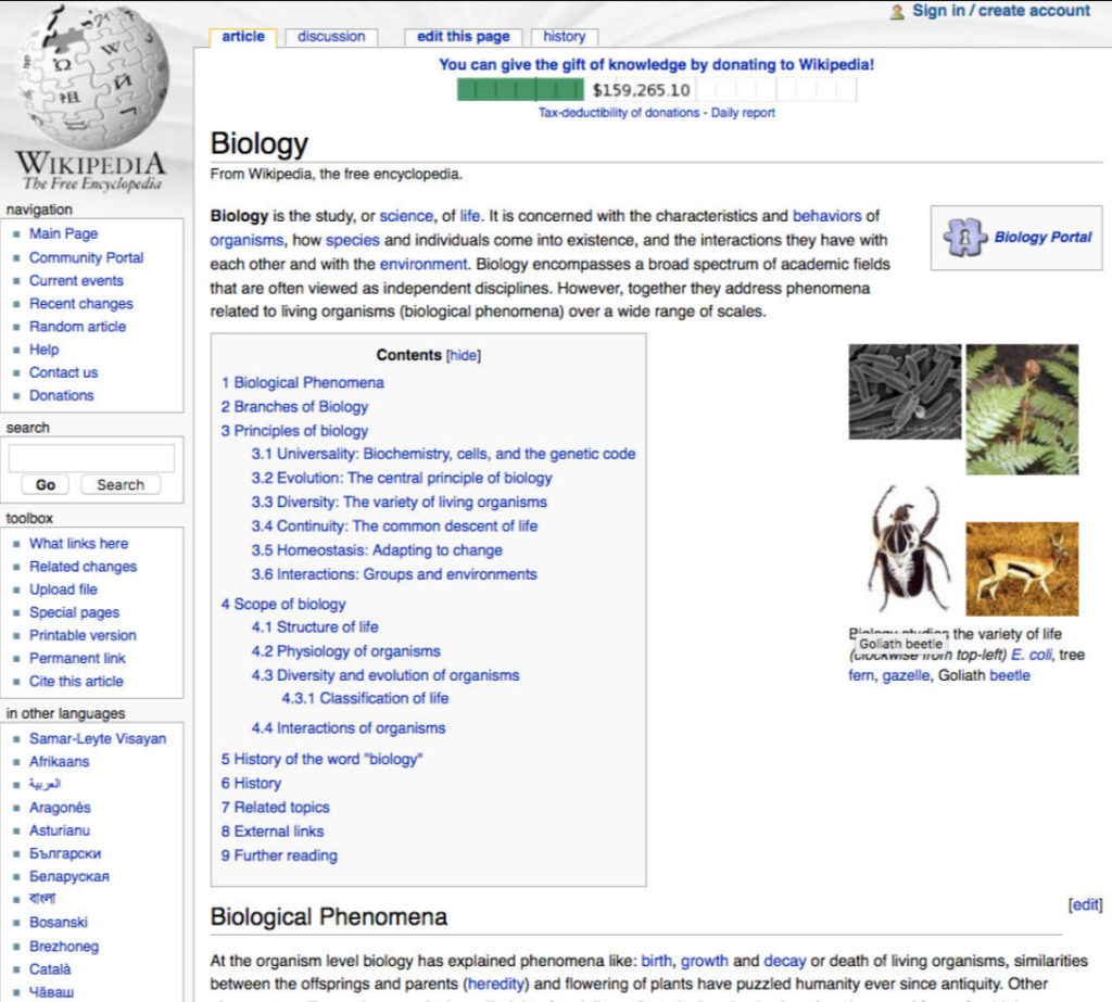
For years, Wikipedia kept an almost unchanged interface: an essential structure, no effects, where design coincided with the absence of distractions. Even the shift from MonoBook to Vector in 2010, while introducing functional and accessibility improvements, didn’t alter its visual grammar: you open an entry and you immediately know where to look.
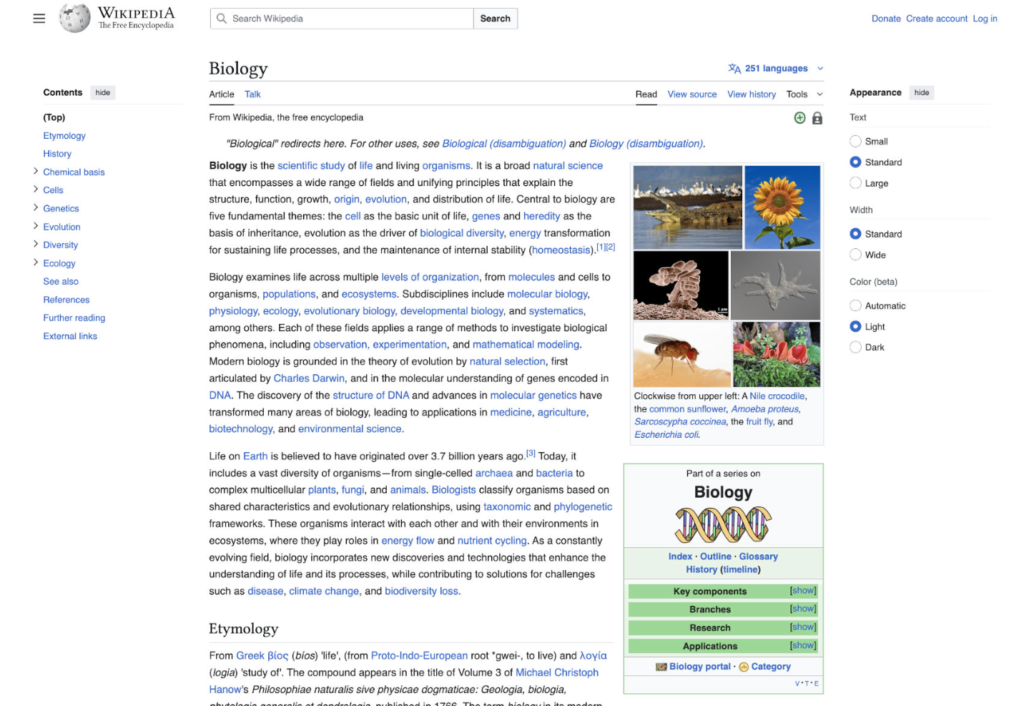
The same goes for Vector 2022, often described as the first real redesign after years. A genuine update, but intentionally understated—made of micro-interventions with more breathing room, less noise, and clearer navigation—aimed at reinforcing long-standing Wikipedia browsing habits. And precisely for that reason, Wikipedia has remained a familiar place to return to.
A comparison with Goodreads, another “vintage” platform
Alongside Wikipedia, Goodreads plays on the same field, but with a different tone. If Wikipedia presents itself like a bright white room, Goodreads feels like a slightly dusty library, built from boxes, columns, and book covers. Launched in 2007—so younger than Wikipedia—the app for keeping track of books you want to read stayed visually anchored to that era for years, to the point of often being criticized for an outdated, not-so-fluid interface. And yet, even here, something still works.
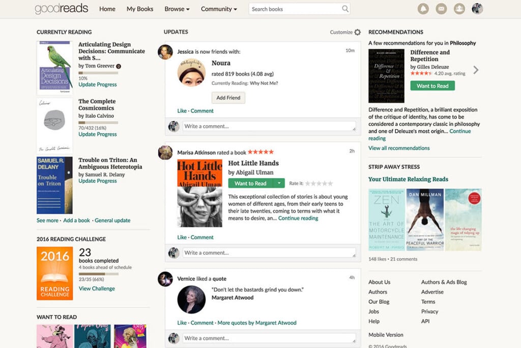
Goodreads’ vintage air—however limiting—seems to communicate a precise idea of stability and continuity. The lists are there alongside the reviews, and everything feels designed to last rather than to constantly update itself into something that belongs to the contemporary world as we know it today. When Goodreads began experimenting with more noticeable redesigns, some users reacted almost defensively: it wasn’t perfect before, but it was familiar. As if changing the interface meant breaking an unspoken pact. In short, Wikipedia and Goodreads, in different ways, share this idea of interface trust. Both reduce cognitive friction, and both make the user feel “at home.”
Wikipedia is always Wikipedia
In 25 years of history, Wikipedia has remained a point of reference because it has never tried to be anything other than itself. By aging without chasing the present, it has built a kind of reliability that is truly sui generis: that of a place that wants to stay the same. In the chaos of today’s web, its stable interface has become something we could even call radical. Opening Wikipedia today, then, means stepping into a space that resists time—and it’s precisely that resistance, more than any update, that seems to be one of the secrets behind its longevity.