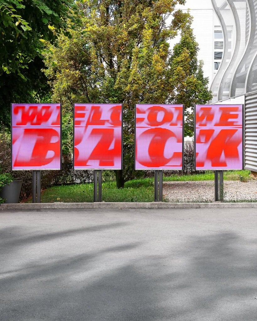
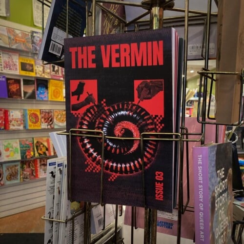
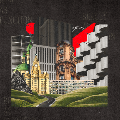
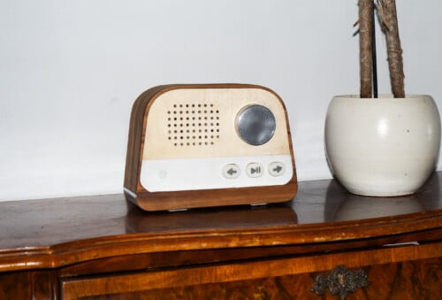
The work of Benoit Brun, a designer from the University of Art and Design Lausannee, spans different fields: typography, posters, visual identity, books, and photography. On his Instagram profile, graphic compositions dominate, with typography playing a leading role—often featuring bold lettering, strict geometries, and a calibrated use of negative space. Some projects take the form of experimental posters, others of simple visual identity exercises, where form and functionality coexist in a sober yet meticulous vision.

Scrolling through his work, a particular attention to the structure of the sign emerges, translating into layouts built with precision and into ongoing typographic research. His solutions oscillate between strict grids and freer compositions, yet always with evident control over visual rhythm. Colors, when present, are used sparingly, often limited to essential palettes that emphasize the contrast between filled and empty space.

In some works, a more experimental approach becomes evident, where the typeface is manipulated or placed in tension with abstract forms, while in others a cleaner, almost editorial direction prevails, functional and refined. This variety does not create discontinuity but instead draws a coherent line throughout his practice: a design that aims for clarity, readability, and a conscious visual construction.

Overall, Benoit Brun’s identity emerges as that of a designer who works by subtraction, allowing details—a curve, an alignment, a typographic weight—to define the character of his projects. A disciplined, contemporary aesthetic that reflects a mature approach even in his most experimental exercises.