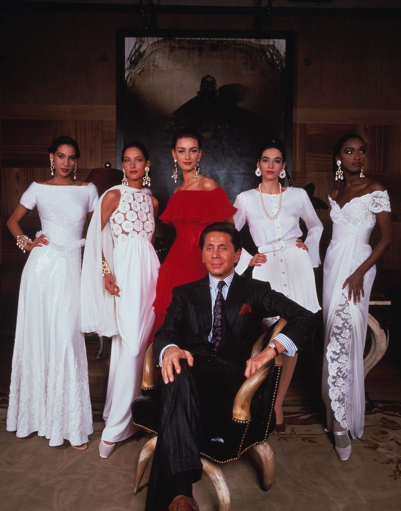
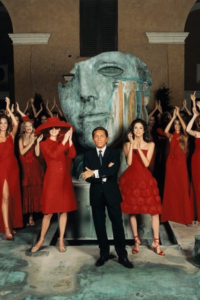
Valentino Red is not just another shade. It is a precise message, instantly recognizable, capable of evoking an idea of distinctly Italian elegance that has transcended decades, seasons, and fashion trends. Long before it became obvious, Valentino Garavani understood that a color could become something deeply identity-defining. And it was precisely through this red that the designer built his own visual universe—before it ever became a branding strategy—making the color an integral part of the maison’s lexicon.
The beginning of this story traces back to an encounter with almost legendary undertones. During a stay in Barcelona as a young man, Valentino was struck by the magnetic presence of a woman dressed in red during an evening at the opera. Amid the crowd, that dress seemed to draw all attention to itself, placing the woman wearing it at the very center of the scene. From that moment on, red ceased to be just a color for Valentino and became an expressive medium—one capable of enhancing the female figure, amplifying confidence, and making it unforgettable. It was the intuition of an aesthetic that placed emotional impact at its core, even before form.
The Chromatic Coordinates of Valentino Red
Within the Pantone color system, Valentino Red has a precise code: 2035 C. It is a carmine shade that contains both a hint of blue and a touch of orange. What makes this tone an enduring symbol is also its ability to move through different eras without losing its strength. From evening gowns worn by actresses and muses of the maison to the most recent runway shows, red remains a fixed point—a constant that withstands shifting creative directions.

Throughout the 1960s and 1970s, as fashion underwent a period of profound transformation, Valentino Red established itself as a constant element within the collections. It was never a random or seasonal red: it was a carefully calibrated tone, refined through continuous experimentation, capable of maintaining intensity without becoming aggressive. A red that dialogued with everything Valentino loved—with cinema, the jet set, beauty, and an idea of femininity that was self-assured yet never ostentatious.
Even in 2022, when Pierpaolo Piccioli replaced Valentino Red with the so-called Pink PP, it proved impossible to forget the color so deeply associated with Valentino Garavani. After all, Pink PP was an undeniably successful experiment—a true chromatic revolution that restored the power of color to the very maison that had made this strategy a defining identity.
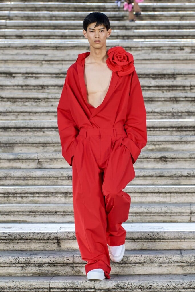
Returning to Valentino Red, it must be acknowledged that this shade needs no superfluous decoration or conceptual scaffolding. It remains the result of an aesthetic philosophy that sees balance and restraint as the true tools of seduction. A red that does not shout, but lingers—like a memory we will continue to associate with the history and legacy of Valentino Garavani.