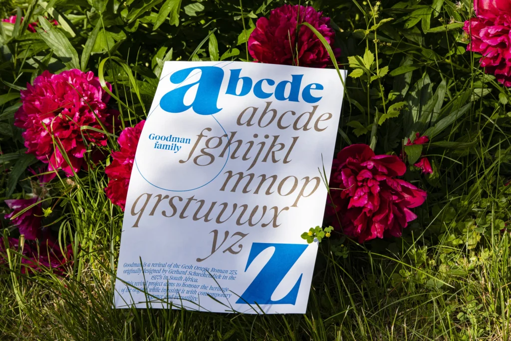
It was 1972 when Gerhard Shwekendiek designed the Gesh Ortega Roman 275, a font particularly close to the serif family – with abundant curves, unusual shapes, and, at the same time, a sensitive soul. When Ethan Nakache discovered the existence of this font, nearly four years ago, he began designing the Goodman with the support of Daniel McQueel, founder of The Designers Foundry. This new font – inspired by Gesh Ortega – comes complete with six weights, matching italics, and in a variable font format.
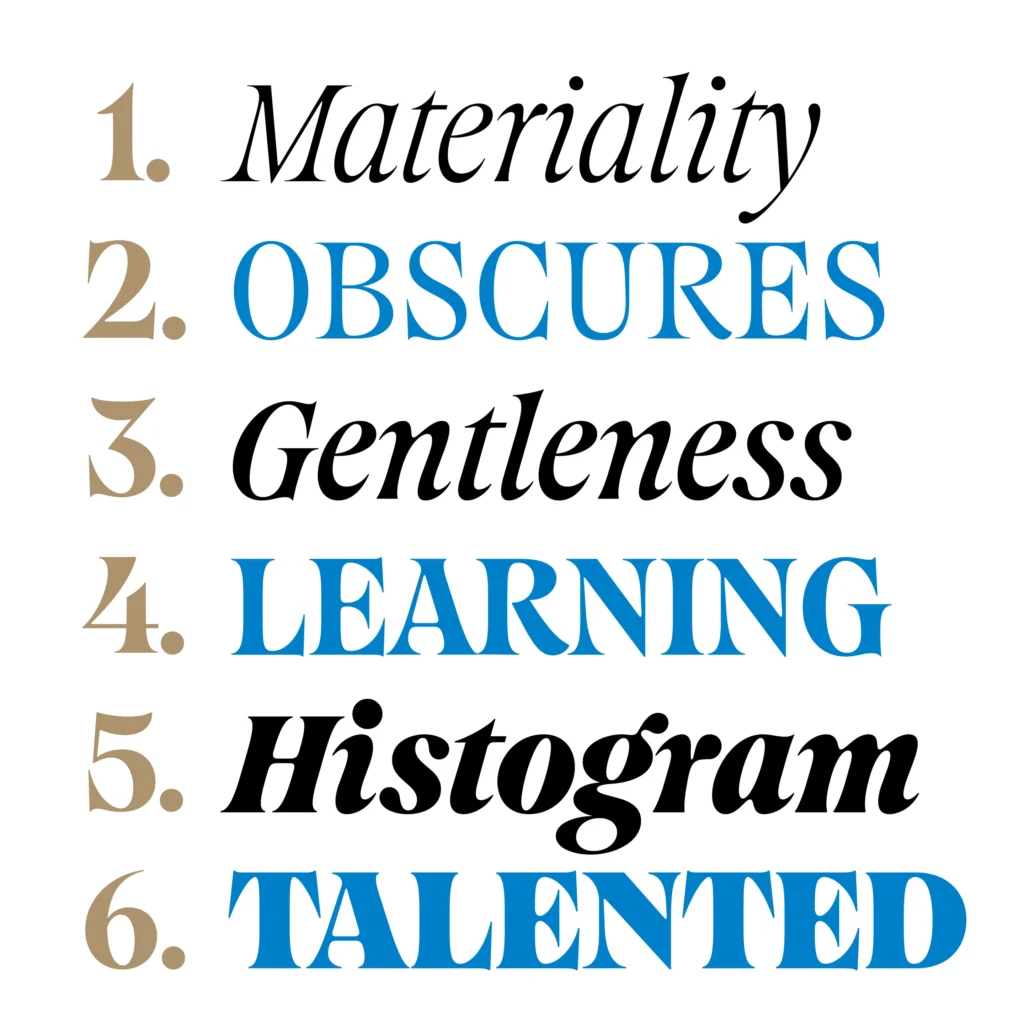

Nakache told It’s Nice That that reviving a typeface involves many decisions, focusing on what to keep and what to discard to shape the new character. After many sketches, he noticed the influence of italic lowercase characters. He wanted to bring inspiration and originality to a historical gem through his personal interpretation. Ethan created many weight variants and an italic version to achieve versatility, enhancing the original style to make Goodman more usable, flexible, and enduring.
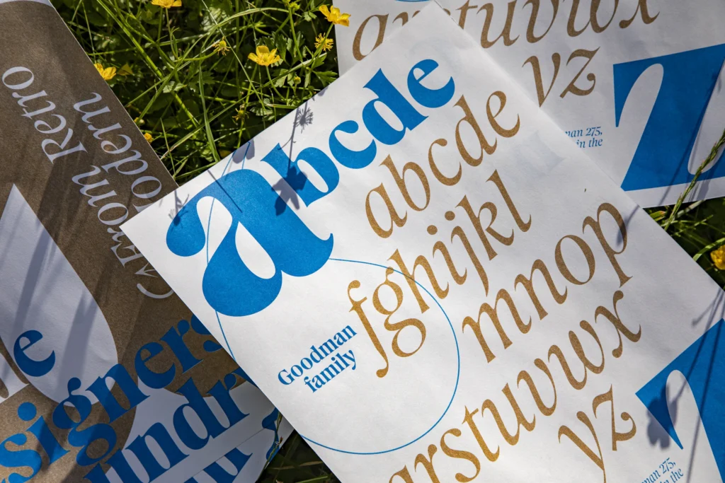
The work that led to the creation of Goodman is now ready to be used in the worlds of fashion, luxury, music, and film. The beauty of type design – as Nakache explains to It’s Nice That – is that designers have no control over how their fonts will be used. So, who knows where we will see Goodman next.