
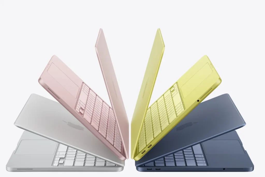
In recent months Apple has started communicating differently than usual. It’s not just about new products, but about a communication strategy that feels more subtle, more layered, almost designed to be discovered little by little. The starting point is the new MacBook Neo, cheaper and extremely colorful. These laptops aim to lower the entry barrier to the Apple ecosystem without giving up the aesthetic that has always been one of the brand’s main tools of seduction.
Behind this choice, however, there is also a broader change in the way we use computers. For years MacBooks have been associated mainly with the creative world and a professional audience: designers, developers, video editors, people who needed to run software that worked particularly well on these devices. Today, however, a large portion of users use computers in a different way. More and more often they are creators, students, or people producing content for platforms like TikTok, Instagram, or YouTube: activities that do not necessarily require extreme hardware, but rather reliable, easy-to-handle devices that are also, why not, recognizable.
In this sense, the MacBook Neo seems to respond to a very clear objective: further expanding Apple’s audience. This is not an entirely new direction. Since the 1980s, the idea of using computers at home has been one of the pillars of the tech imaginary built around the figure of Steve Jobs, who always described Apple as a company capable of making technology more accessible and intuitive. The new models seem to pick up that very vision, adapting it to a completely different digital context.
The interesting thing is that this strategy first and foremost works through details. The new models arrive with a color palette that immediately recalls the brand’s historical memory: bolder colors reminiscent of the chromatic strength of the first iMacs. It is not a literal return to the past, but rather an update of that idea of playful and accessible technology that, in the late 1990s, transformed the computer from a technical object into a cultural one.


And this is exactly the level Apple seems to be working on today. Colors become a way to connect different generations of products and users. The new pink, for example, is not just a new colorway, but part of a broader narrative that nods to the Y2K aesthetic we all love so much.

On TikTok, right after the launch, the Cupertino company started posting videos that wink at this new strategy. One of the most curious shows a miniature old iBook that, when opened, reveals a makeup blush: an ironic pairing that seems to reference the new pink shade of the latest MacBook Neo. It’s unclear whether these are orchestrated contents or simply a collective imaginary feeding itself, but the result is the same: Apple once again manages to get people talking about its products without appearing too explicit about it.
@apple getting ready
♬ original sound – apple
Another perfect example of this philosophy emerged on the profile of @fuwad.design, which showed how Apple continues to hide small graphic easter eggs inside its device wallpapers. The new MacBook Neo, for example, comes with a default background where the abstract shapes are far from random: looking closely, you discover that they form the word “MAC,” and the same applies to other products as well.
Visualizza questo post su Instagram
This is nothing new. For years Apple has been embedding these hidden micro-typographies in the wallpapers of Mac, iMac, MacBook and even Mac mini. The shapes are not simple decorative patterns but structures designed to echo the product’s name, a choice that perfectly reflects the company’s design approach: almost invisible details that initially go unnoticed but, once discovered, become impossible to ignore.
Today, Apple’s strategy seems to be built more on small signals than on big declarations. From colors that reference the brand’s history and viral videos suggesting new color palettes on TikTok to wallpapers that hide typographic messages. All of this contributes to building a coherent visual narrative in which the products become easily recognizable even to a broader audience, less tied to the professional sphere and closer to creator culture.

Yet an interesting question remains. Will making these devices more accessible also make them less symbolic? Apple has built much of its strength on the ability to transform technological objects into cultural status symbols. Lowering the price and expanding the audience could, at least in theory, risk weakening that exclusive aura.
But perhaps this is exactly where the real strategic move lies. Rather than losing status, Apple seems intent on redefining it. No longer just a tool for professionals or people working in creative fields, but a recognizable object within a much broader cultural ecosystem. Not something only a few people can have, but something more and more people want to be part of.