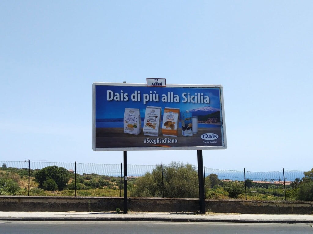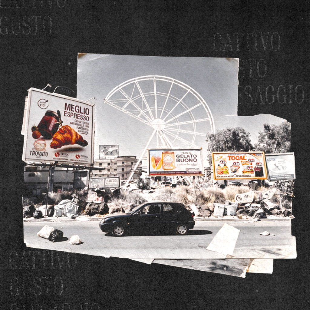
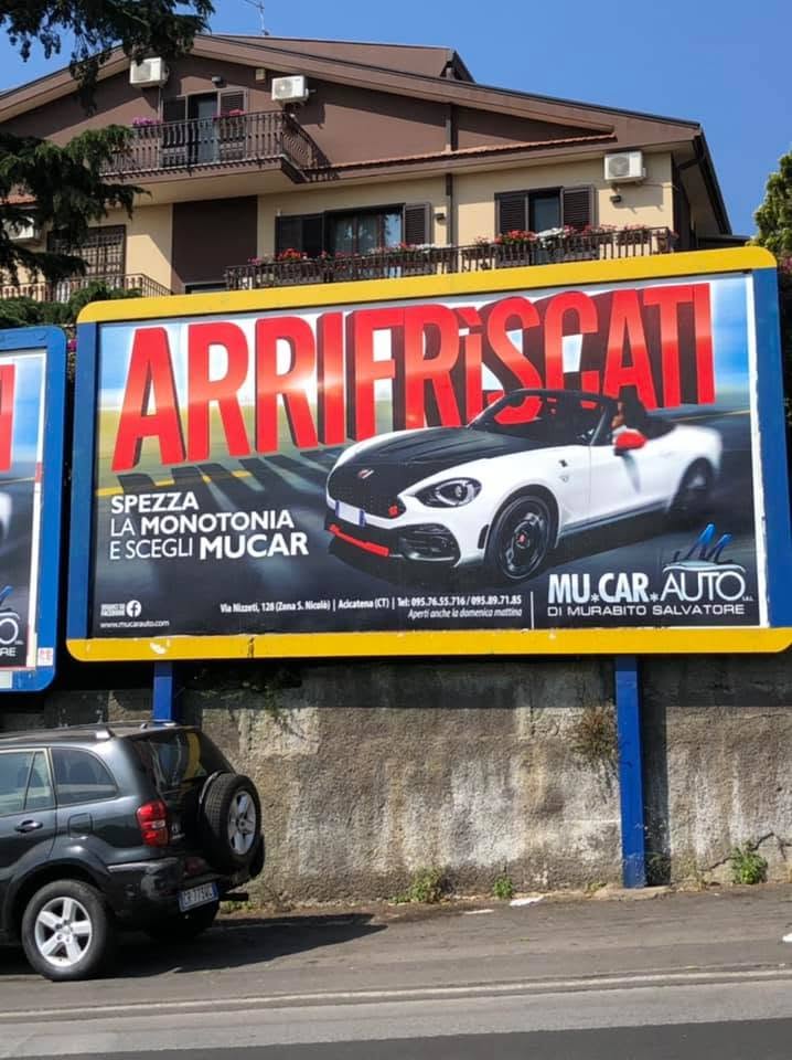
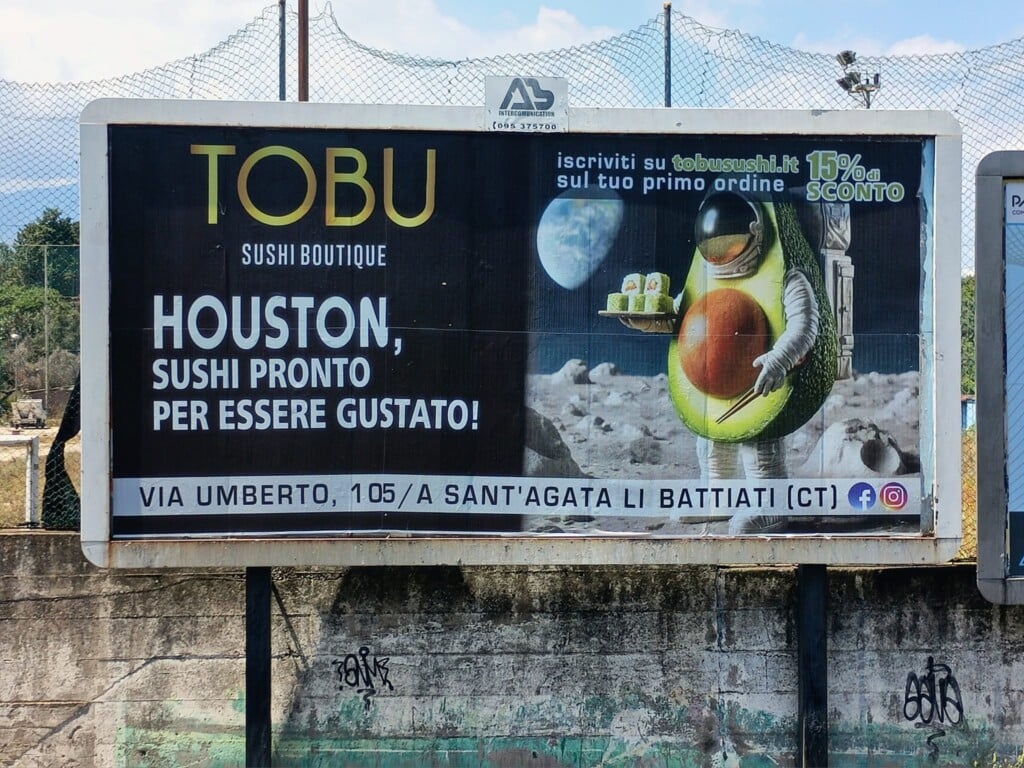
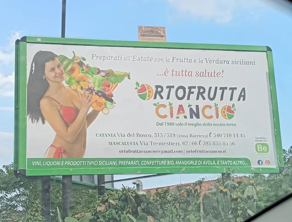
When I go back to Catania, one of the first things that catches my attention, on the road from the airport toward home, is the billboards, one after another. A gym, a car dealership, a beauty center, a dental practice, a village food fair, a window-fitting shop. They are the things a city says about itself to those who arrive, and usually nobody really looks at them, least of all the people who live there.
I look at them out of professional habit, and what I see is always the same way of thinking. The gradient background, the outlined typeface with a drop shadow, the phone number in yellow on red as big as the badly cut-out face next to it, three different fonts in the same square meter and the distinct feeling that at no point in the whole process did anyone take something away. Then come the shop signs, the windows, the lower thirds on local TV, the flyers under windshield wipers, and it’s as if everything had to scream in order to exist and therefore needed more colors, more words, more effects, with the result that every element tries to be the most important and in the end none of them is.
I was born here in Catania, studied between Rome and Milan, have lived in Milan for thirteen years and have worked in communication for eighteen, first at several agencies and then by founding Collater.al together with other partners. I don’t say this to claim any authority over what is beautiful and what is ugly, but because after a while this job warps your eye and no longer lets you see a billboard as a simple presence. You read its hierarchy, its tone, its intentions, and you always end up asking yourself what it is trying to tell you and why it chose to say it in exactly that way.
The problem, though, is never the single ugly poster, which can happen anywhere and sometimes even has a certain unintentional grace. The problem is the moment when the ugly stops being an episode and becomes landscape.
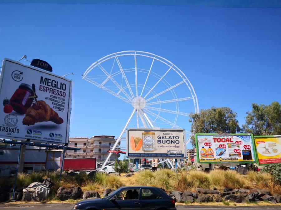
Years ago some friends, design and advertising professionals, opened a Facebook page with a perfect title, “Catania Advertising il peggio” (the worst of Catania advertising), where improbable logos, impossible photomontages, unintentionally comic slogans and layouts in which everything had been added and nothing ever taken away ended up. We laughed a lot, and bitterly, trying to draw out some reasoning, but behind our sarcasm that page was archiving an impoverishment that didn’t concern form alone. It concerned the way a shop, an institution or a news outlet decided to present itself to others. It was the story of a city that was learning to stop seeing.
I know very well the risk of a discussion like this, which is that of someone who leaves Sicily, goes to work in Milan and then comes back home to measure everything with his own yardstick, the snobbish nostalgia of the creative director on a visit. Milan too is full of bad communication, only it is smoother, more correct, more anonymous, built on the same references and the same templates until it becomes indistinguishable from itself. They are two different ways of ending up in the same place, one accumulates and the other flattens.
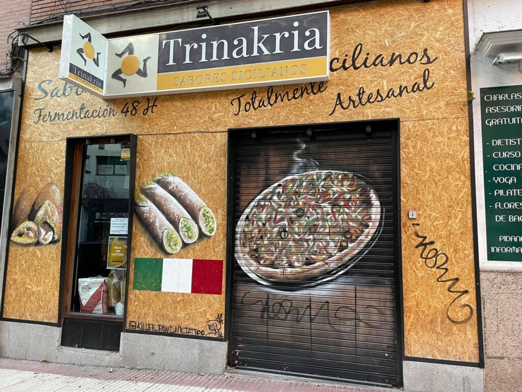
There is also a paradox that makes everything more jarring, which is that Sicily is not at all a visually poor territory. It has a very strong and layered visual culture, built over the centuries through the Baroque, lava stone, majolica tiles, painted carts, market signs and the apparatus of religious festivals, an imagery born from the meeting of different dominations and rituals in which the sacred and the profane coexist without embarrassment. Density was never the problem, because a painted cart or a Baroque facade are rich and theatrical but answer to precise techniques, hierarchies and meanings, and ornament does not coincide with bad taste. The short circuit arises when that culture is reduced to a warehouse of ready-to-use symbols. By dint of being repeated, tradition stops being living culture and becomes decoration.
I don’t think talent or training are lacking either. In the city there are programs dedicated to visual communication design and studios that work seriously on the relationship between project and territory. The professionals are there, it’s just that they often go looking elsewhere for the opportunities they don’t find here. The territory doesn’t know how to recognize them, involve them and attribute value to their work.
Talking about it with my wife, who is a graphic designer, I was met with the most serious objection of all. Doesn’t educating everyone in the same way risk producing a flattening? Perhaps, but for me visual education shouldn’t establish what people ought to like, but give them the tools to make and understand choices. Teaching grammar doesn’t oblige anyone to write the same novel.
In 1979 Pierre Bourdieu published an essay titled Distinction and showed that taste is not at all an individual and spontaneous matter, but the product of an upbringing and a social origin, and that it works as a class marker. Without education, taste doesn’t remain free, it remains inherited, and distributed in a profoundly unequal way. Bruno Munari, for that matter, was already teaching at the end of the 1960s the course from which Design and Visual Communication would come, convinced that reading images was a basic skill and not a specialization for insiders. At school we spend years learning how to build a sentence and almost no time understanding how to read an image, even though by now a good part of what we know, desire and believe reaches us in visual form.
I was taught that form is content, and today I would say that form organizes content even before we can understand it. A public notice written all in capitals and full of prohibitions doesn’t provide information, it establishes an aggressive relationship with the reader. A lower third surrounded by red, animations and exclamation marks turns any news item into an emergency. Political communication built on distorted faces and extreme contrasts prepares us for conflict before anyone has read a single word. Form decides what is important, what emotion we should feel and what role we are assigned. It can make information clearer but also make a lie more believable, and precisely because it produces trust it carries a responsibility.
This awareness is lost when design is considered a decoration to be added at the end and the designer is called in after the message, the medium and every decision have already been made, with the sole request of making everything more visible. It is lost when knowing how to use software is mistaken for knowing how to design. Above all it is lost when a culture of commissioning is missing, because it isn’t enough for good designers to exist if those who assign the work can’t formulate a problem, recognize a good answer or defend a choice. Design is born from a relationship, and when one of the two parties doesn’t attribute value to it the project is reduced to mere execution.
Digital tools have made the production of images and video accessible to everyone, but the democratization of tools does not coincide with that of skills, and generative artificial intelligence has taken the misunderstanding to the extreme by making it possible to obtain in a few seconds a story, an illustration, a visual identity or a social strategy. The speed and plausibility of the result can make people believe they possess skills they don’t have, that they can write a story without ever having read any, or do communication without knowing an audience, a context and a goal. Competence is not the ability to generate something, it is the ability to judge it, modify it, discard it and take responsibility for it.
A vicious circle is created this way, because if every billboard screams then silence looks like a mistake, if every centimeter is filled then empty space looks wasted, and if everything is saturated then restraint is mistaken for weakness. Repetition lowers the threshold, and what at first seemed ugly becomes first normal and then invisible. A city, after all, also educates through what it shows every day, and its streets, signs, public transport and institutional communications work as an involuntary school that teaches us what deserves care and what can be left to improvisation. I don’t think a bad billboard leads directly to bad politics or bad journalism (or maybe it does?), but they belong to the same ecosystem, one in which reaction is preferred to understanding and to the construction of meaning.
Our visual landscape shapes the way we think.
From here the aesthetic problem becomes political and ethical as well, not because good taste makes people morally better, but because every form of communication contains an idea of who will receive it and can either recognize their intelligence or merely capture their attention. Educating people in visual communication should then mean teaching them to see, because that road from the airport to home, seen once, is funny, but seen for twenty years it stops being a series of mistakes and becomes the way a city has decided to look at itself.