Cam Miller is a freelance illustrator and designer, and his work exists at the intersection of typography, illustration, and graphic design. As stated on his website, while his initial vocation was advertising, at a certain point during his studies he changed direction and moved toward illustration. He thus transformed his design foundations into an essential, direct, and immediately recognizable style.

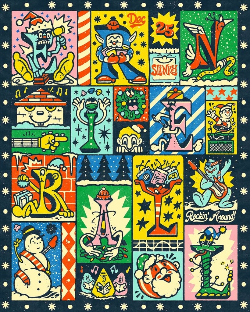
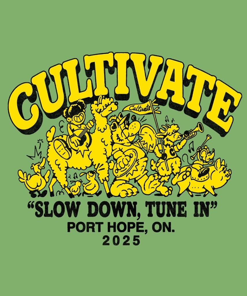
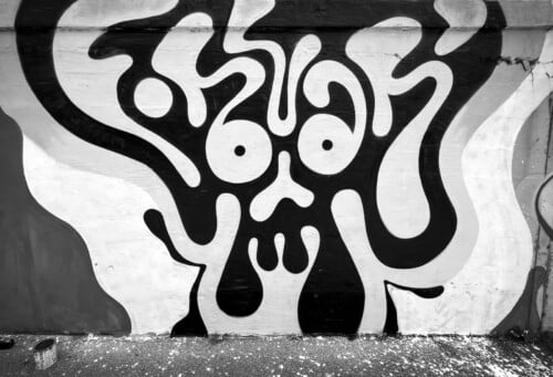
In his work, typography is an integral part of the image, not merely a decorative element. Letters, shapes, and colors coexist in compact, legible compositions, designed to work at a glance. There is a clear graphic rigor, balanced by a contemporary illustrative approach that retains energy and personality.

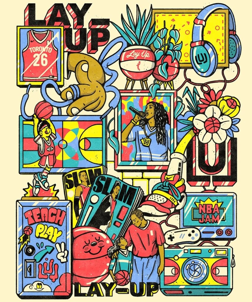
His background in advertising emerges in the attention to communication and visual impact: each project is conceived to be clear, concise, and context-aware, without sacrificing a strong stylistic identity. This approach has allowed him to work with a wide range of clients, from the Toronto Raptors and TFC to international brands and magazines such as Men’s Health, Women’s Health, and Ernie Ball.
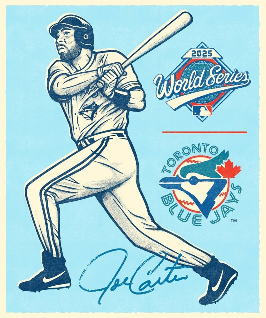
On Instagram, his work appears as an orderly sequence of illustrated lettering and graphic compositions, where a few well-calibrated elements are enough to build effective images. In an increasingly saturated visual landscape, Cam Miller stands out precisely for his ability to synthesize and for a formal clarity that does not go unnoticed.