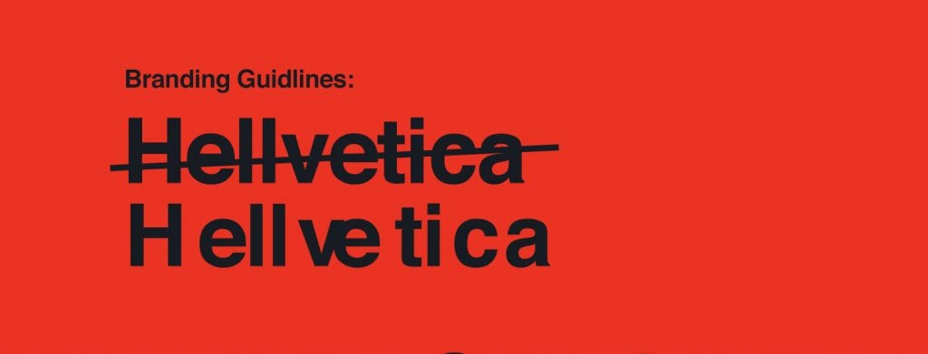
The approximation is not contemplated in the world of graphics, everything must be perfect and calculated to the millimeter. That’s why the two creative directors Zack Roif and Matthew Woodward thought it was a good idea to pull a prank on graphic designers all over the world by playing with the famous Helvetica font and transforming it into Hellvetica, a character with serious problems related to kerning.
For those who are not in the industry, with kerning we mean the reduction of the space between one letter and another in order to minimize the white spaces.
Starting to write with Hellvetica you will notice immediately that the space between the letters seems purely random and if this inaccuracy in the graphics makes you crazy, imagine the insiders.
Moreover, the choice to modify the iconic Helvetica character is not accidental, in fact, the font invented in 1960 by Eduard Hoffmann and Max Miedinger is famous for its precision and cleanliness.
If you want to try to write with Hellvetica you can download it on the official site, if not look at some examples in our gallery.