There are logos that are imprinted in our minds—symbols that, on their own, can tell stories, evoke worlds, and become part of our visual memory. The Warner Bros. logo is one of them.
But this logo doesn’t just hold the plots and stories of thousands of characters—it also hides a personal history made of evolutions, changes, and transformations as fascinating as the films it introduces.
Founded in 1923 by the brothers Harry, Albert, Samuel and Jack Warner, the company began with traveling screenings and small movie theaters between Ohio and Pennsylvania. A few years later, it moved to Hollywood, finding in California the perfect ground to grow and build an entertainment empire. From there, the step toward successful cinema and television was natural, leading to films that became icons, TV series that captivated audiences, and animated productions that shaped the childhood of thousands of children.
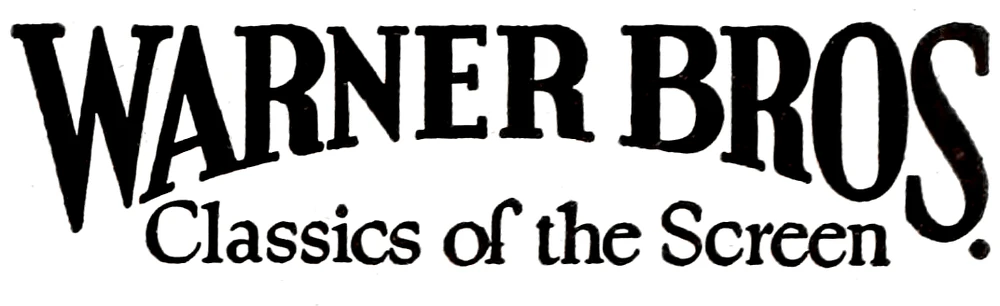
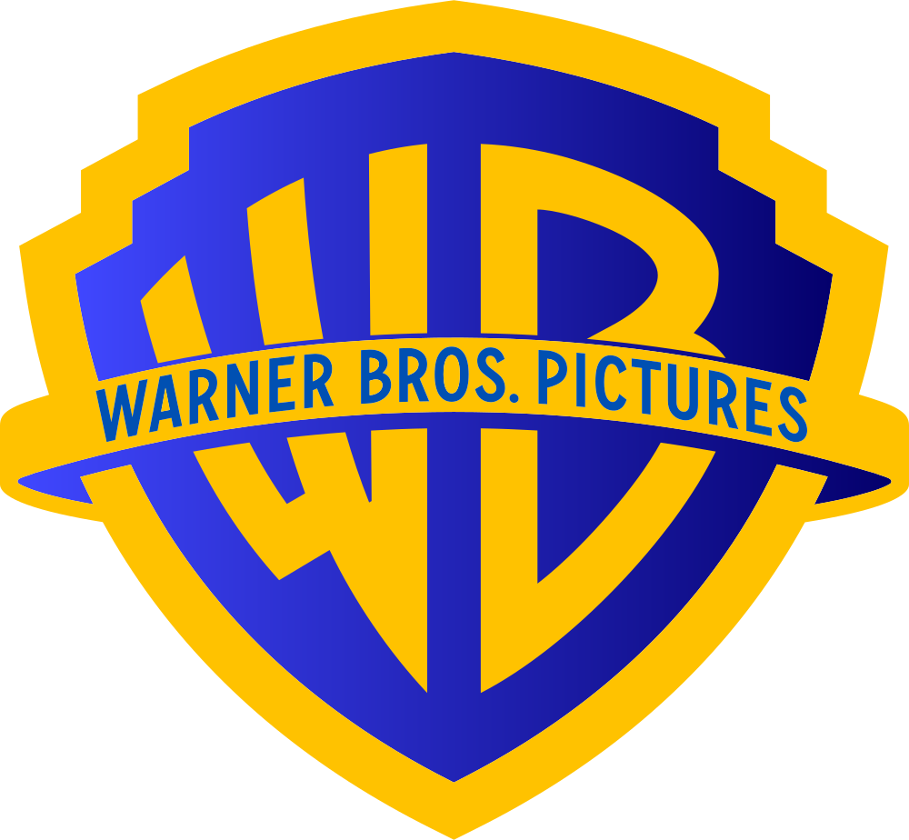
The first logo dates back to 1923, characterized by an elegant, serif, all-uppercase logotype—far from the one we know today. It was two years later, in 1925, that the shield appeared for the first time, with the famous “WB” monogram inside, destined to become the core of Warner Bros.’ identity. From that moment on, the logo continued to evolve without ever losing its essence.

In the 1930s, the design became more streamlined, giving more space to the letters, while the curved banners and more decorative lines of the post-war period added a sense of elegance and authority. In the 1950s, a more essential version emerged: stripes and three-dimensional shading were removed, returning to a clean and recognizable form that would remain etched in the memory of generations of viewers.
There were also more radical versions. In the 1970s, the famous “Big W” designed by Saul Bass introduced a bold, geometric design, criticized by many but impossible to ignore. Even when the logo changed drastically, the shield always returned, acting as a fil rouge connecting all versions.

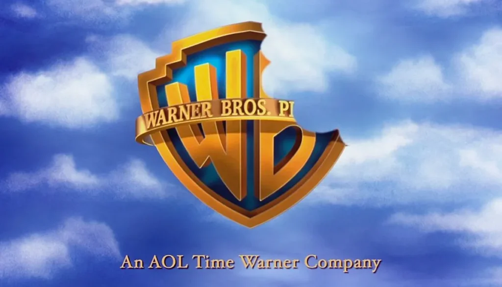
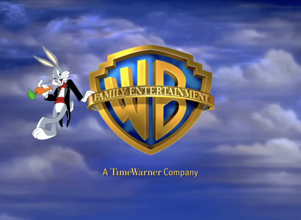
It was in the 1980s that the logo took on what is perhaps its most iconic form: three-dimensional, floating in a bright sky, with golden reflections and an elegant ribbon. This is the version that lasted the longest and the one many of us picture when thinking about Warner Bros.

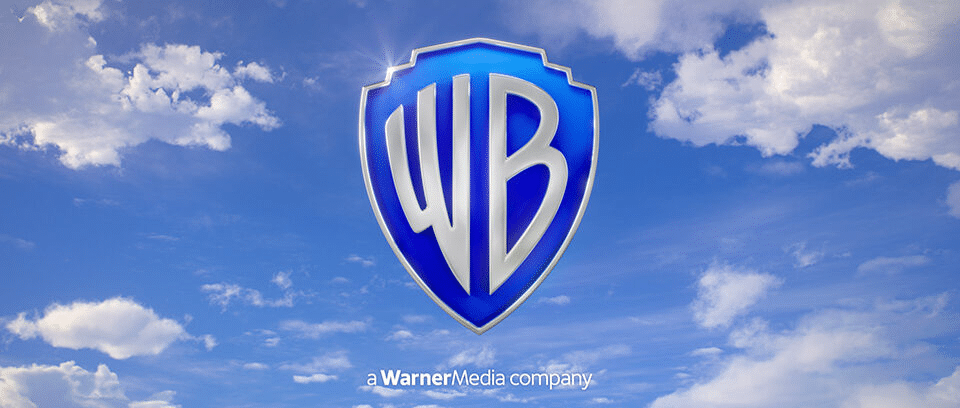
In 2019, the logo underwent a major redesign, shifting toward a more minimal version aligned with contemporary trends. The shield remained, as did the letters, but everything else was reduced to the essentials. It’s a perfect balance between tradition and modernity, preserving its historical identity while adapting to new screens, media, and audiences—and beyond.
Over the years, the Warner Bros. logo hasn’t just evolved alongside technology and design trends—it has always adapted itself to the film or show it introduces.
There are perhaps three of the most iconic and emblematic cases where we can clearly see how the shield changes depending on the production.
The first is tied to the Looney Tunes series, where the logo often becomes an interactive element: Bugs Bunny, Daffy Duck, and their eccentric friends jump on it, use it as a portal to pop in and out, and much more.
We also can’t overlook the Batman films, where the logo takes on a darker, more dramatic tone. The shield becomes more austere, sometimes featuring wings or metallic details that echo the bat symbol itself.
Another saga that shaped the history of Warner Bros. is Harry Potter. Here, the shield evolves alongside the tone of each film, becoming darker and more integral to the storytelling.
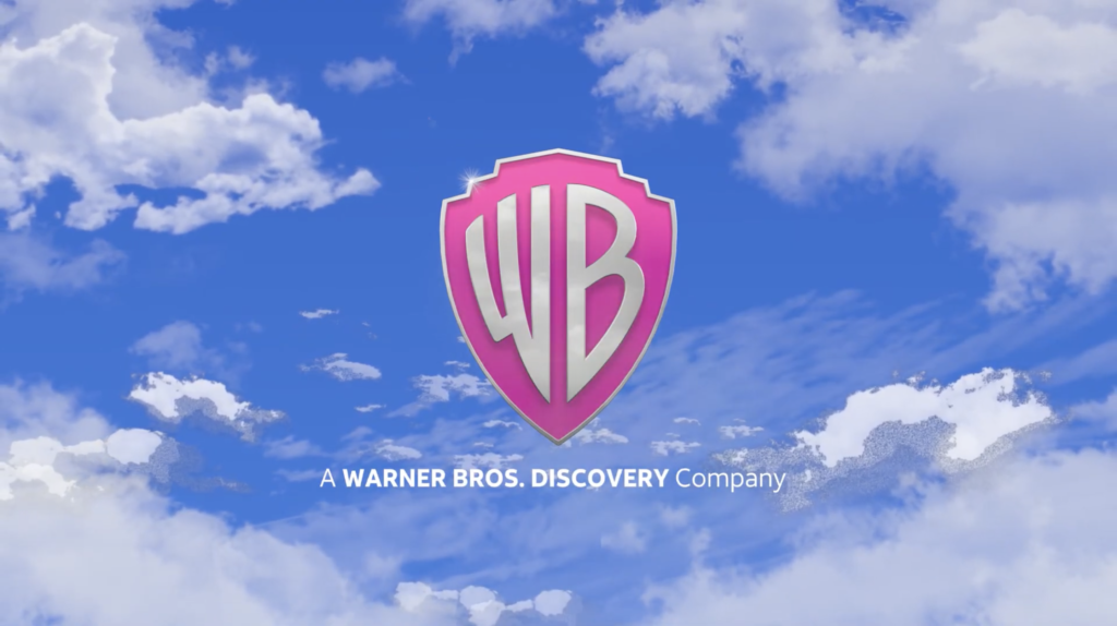
But the variations don’t stop there. Every Warner Bros. film or series has its own identity: in The Polar Express, the shield is covered in icicles; in Barbie, it turns pink; in You’ve Got Mail, it becomes a desktop icon—and the list could go on forever.
And yet, behind this visual magic, there’s also a more melancholic side. After nearly a century of independence and steady growth, Warner Bros. now seems set to be sold to Paramount Global, opening a new chapter that many are already questioning and that, for now, feels uncertain.
The golden and blue shield—symbol of dreams, films, and imaginary worlds—remains there, unchanged in the audience’s memory, alongside Bugs Bunny’s “What’s up, doc?”, the darkness of Gotham’s skies, and the magic of Hogwarts. Every time we see it, it reminds us to keep dreaming—and that even if eras change, its films will always remain exactly the same.