The Olympics are not only about sport, but also about storytelling. And today we’re focusing on the visual storytelling of some Winter Olympic Games that made history in the field of identity. A system of signs—logos, mascots, posters, patterns and merchandising—that reveals how a country wants to be seen by the world. Tracing the most iconic identities of the Winter Olympics means taking a close look at the evolution of graphic design, institutional branding, and the relationship between pop culture and major sporting events that are also global. An excursus that today returns to spark our curiosity about a topic as fascinating as it is current, with Milano Cortina 2026 just around the corner.

From the almost handcrafted solutions of the 1950s to the digital experiments of the 2000s, the Winter Olympics have often anticipated trends, reflecting social, political and aesthetic shifts. Some editions, more than others, managed to build an imagery that is still instantly recognizable today. And as the first stop on this excursus, we’ve chosen Cortina.

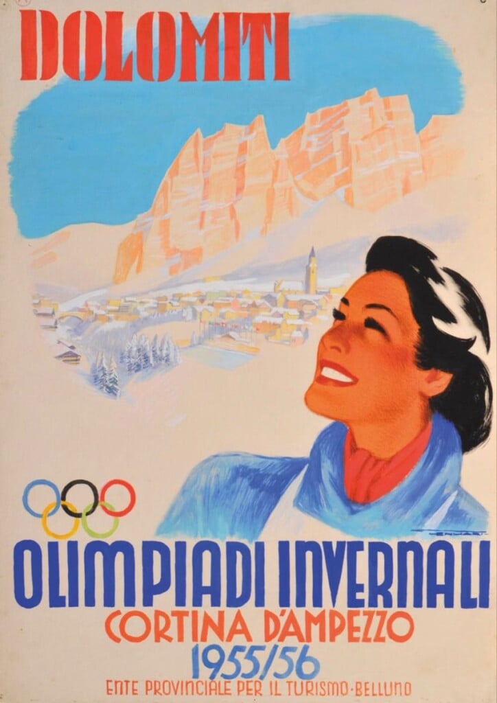
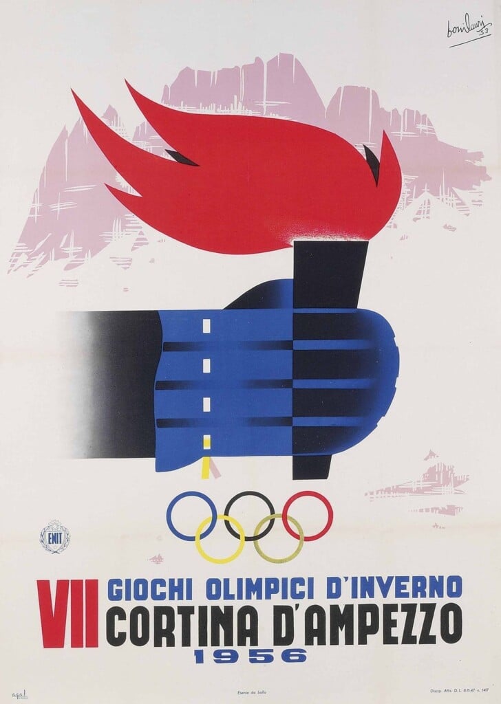
Cortina 1956
The Cortina Olympics in 1956 mark a foundational moment: the first Winter Olympics hosted in Italy and the first major sporting event broadcast on television in Europe. The identity reflects an era in which the concept of branding was still far off. Yet the logo—with its iconic edelweiss and the Olympic rings—already spoke to an elegant graphic language influenced by European modernism and the postwar illustrative sensibility. The official posters leaned into an idealized, almost cinematic depiction of the mountains, while the merchandising remained minimal, conceived more as a keepsake than a mass-market product. A sober, institutional aesthetic that today feels very distant, yet incredibly coherent. But now, let’s move on to the ’70s.
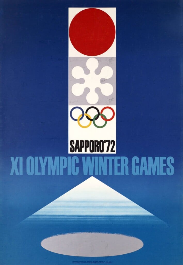
Sapporo 1972
With Sapporo 1972, the Winter Olympics definitively enter the era of modern design, thanks in part to the creative direction of Japanese graphic designer Yusaku Kamekura. The first Asian edition of the Games marks a turning point with a rigorous, essential visual system strongly influenced by Japanese graphic design. The logo—an abstract red sun above the Olympic rings—is a manifesto of visual synthesis, while the pictograms become a universal language still studied today. Here, identity is not mere decoration, but a system: modular, repeatable, designed to work across posters, signage, print and merchandising. An approach that anticipates the contemporary concept of brand identity by decades.
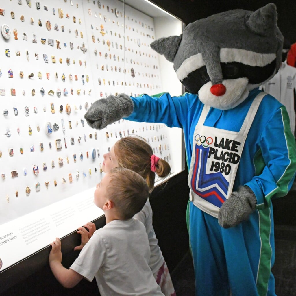
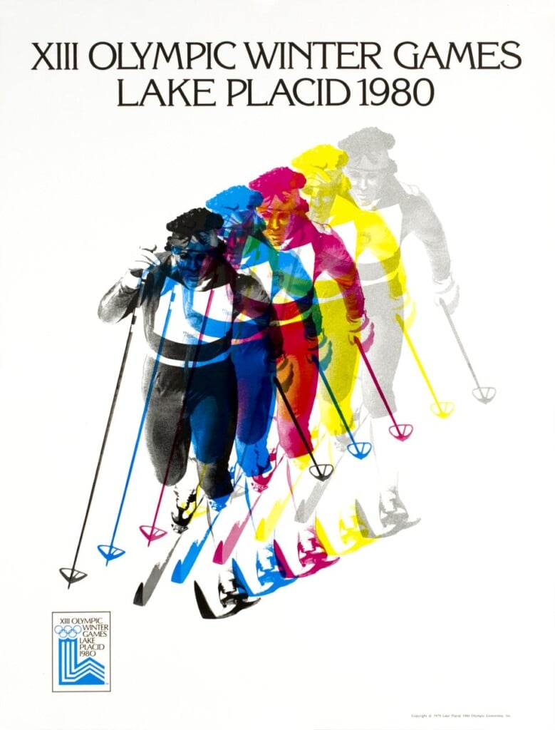
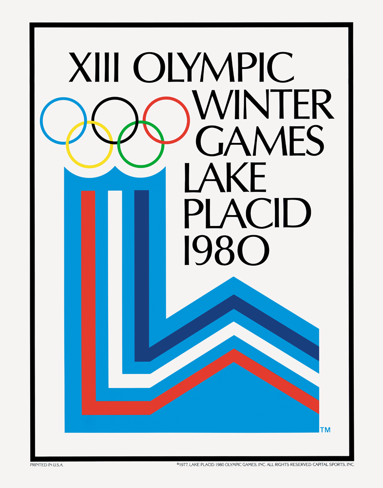
Lake Placid 1980
The Lake Placid Olympics in 1980 capture America at the turn of the ’70s and ’80s: patriotic, pop, and highly communicative. The logo plays with geometric forms and bright colors, while the mascot Roni the raccoon embodies a decisive shift toward pop culture and mass merchandising.

This is where the mascot stops being a simple symbol and becomes a character—a product, a reproducible icon. Posters, pins, patches and gadgets build an immediate, accessible imagery designed to circulate far beyond the sporting event itself. An identity less refined than others, but extremely effective.
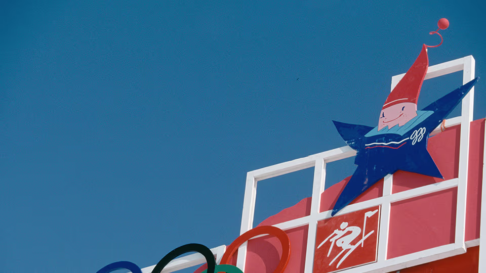
Albertville 1992
Albertville 1992 is probably one of the most controversial editions from a sporting standpoint, but visually it represents an interesting moment. The logo, almost calligraphic, breaks with the modernist rigidity of the past and introduces a more emotional and artistic dimension.
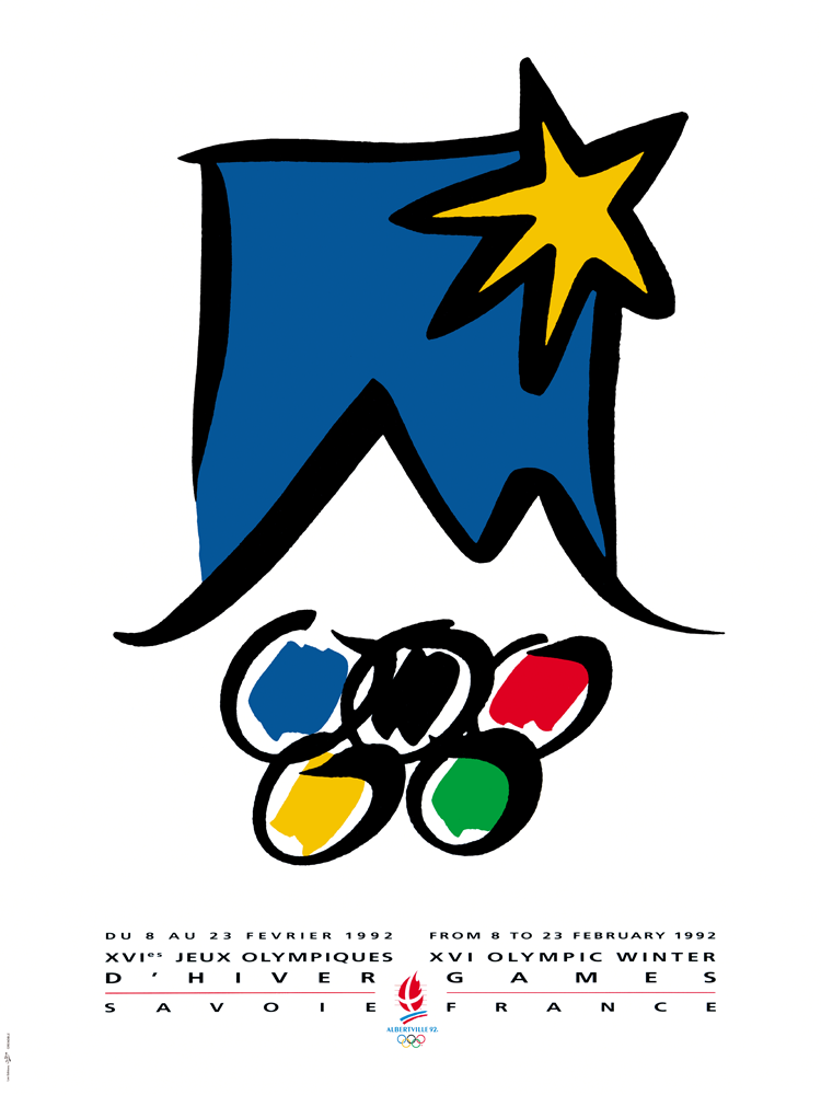
The mascot Magique, with its anthropomorphic star, reflects the ’90s: saturated colors, soft forms, and an aesthetic that nods to the emerging digital design language. The identity is less systemic, more fragmented, but it captures a transitional phase well—one in which the Olympics begin to contend with an increasingly young, global audience.
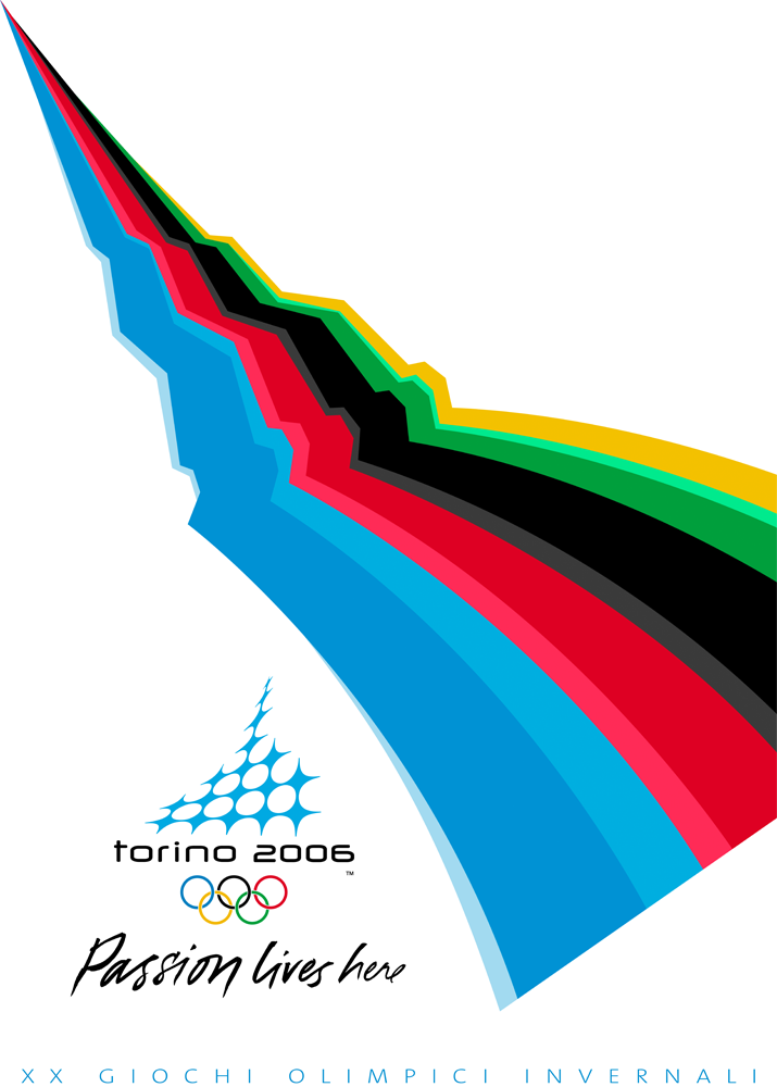
Turin 2006
With Turin 2006, the identity returns as a complex, layered project. The logo—the ice crystal that transforms into the Mole Antonelliana—is a highly successful example of local symbolism reinterpreted in a contemporary key.
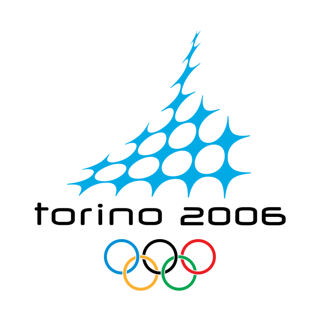
The mascots Neve and Gliz introduce an almost cartoon-like dimension, but the overall graphic system is solid and coherent, able to connect with architecture, urban planning and digital communication. It’s one of the first Winter Olympics to truly think of identity as an ecosystem, anticipating dynamics that today are taken for granted.

Looking at these editions, it’s clear that the Winter Olympics have been—perhaps just as much as the Summer Games—a privileged visual laboratory. Milano Cortina 2026 inherits a century of experimentation, successes and contradictions and this year, the challenge isn’t only to create a recognizable image, but to build an imaginary capable of enduring over time, as each of the historic identities we’ve revisited today has done in its own way.