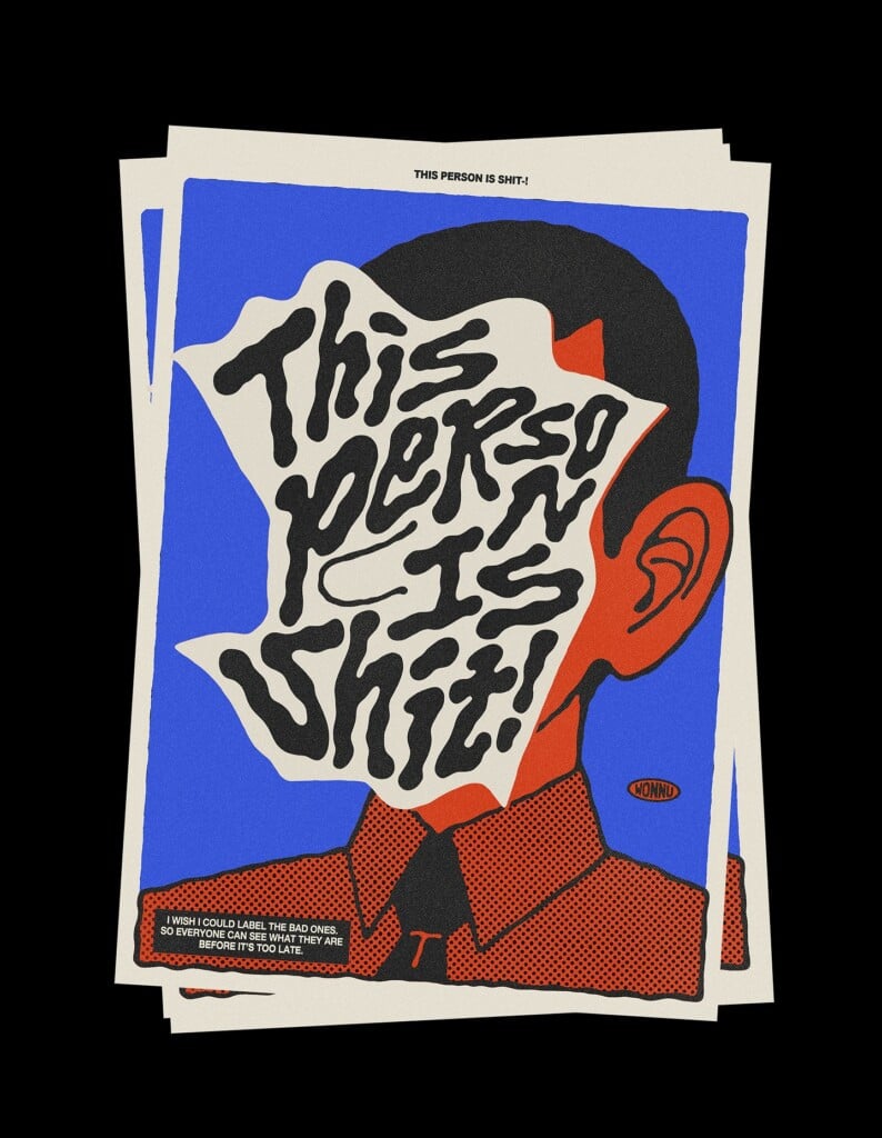
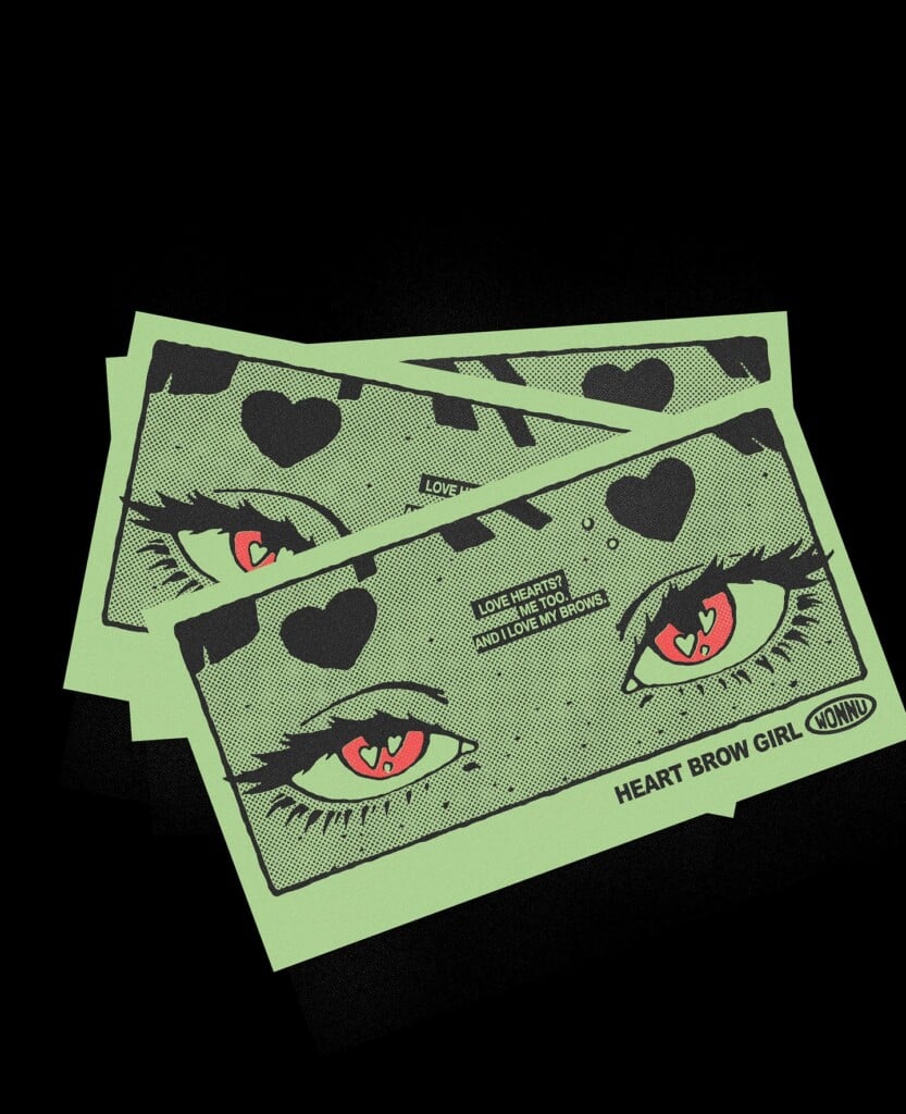
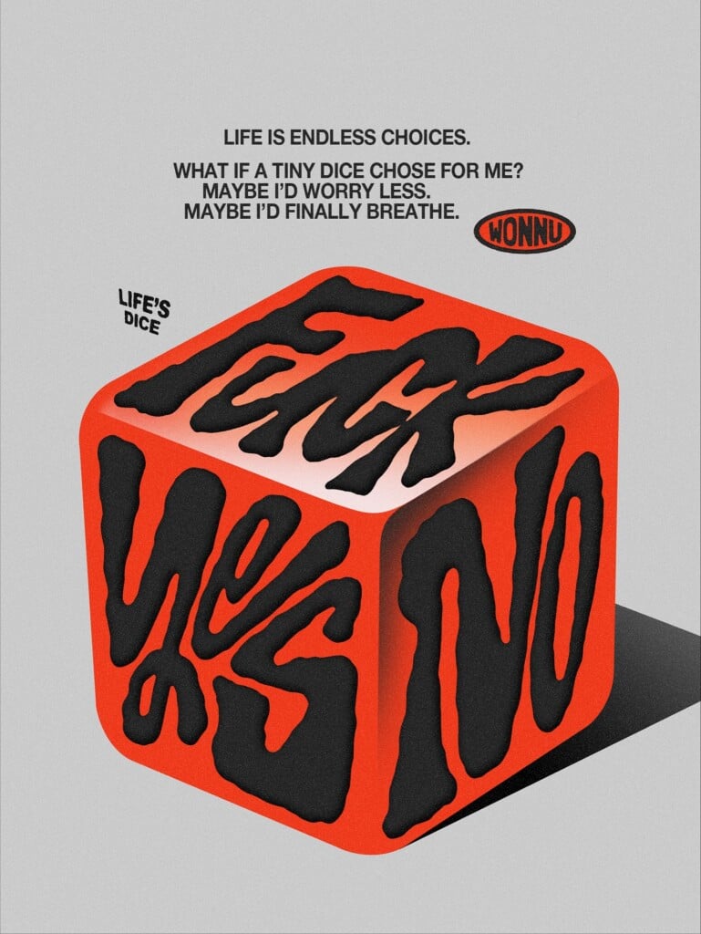
In Wonnu Joke’s feed we find an approach to graphic design that focuses entirely on the coexistence between word and image. The South Korean designer, based in Seoul, builds a visual archive made of posters, short phrases, and typographic compositions that work as immediate messages.
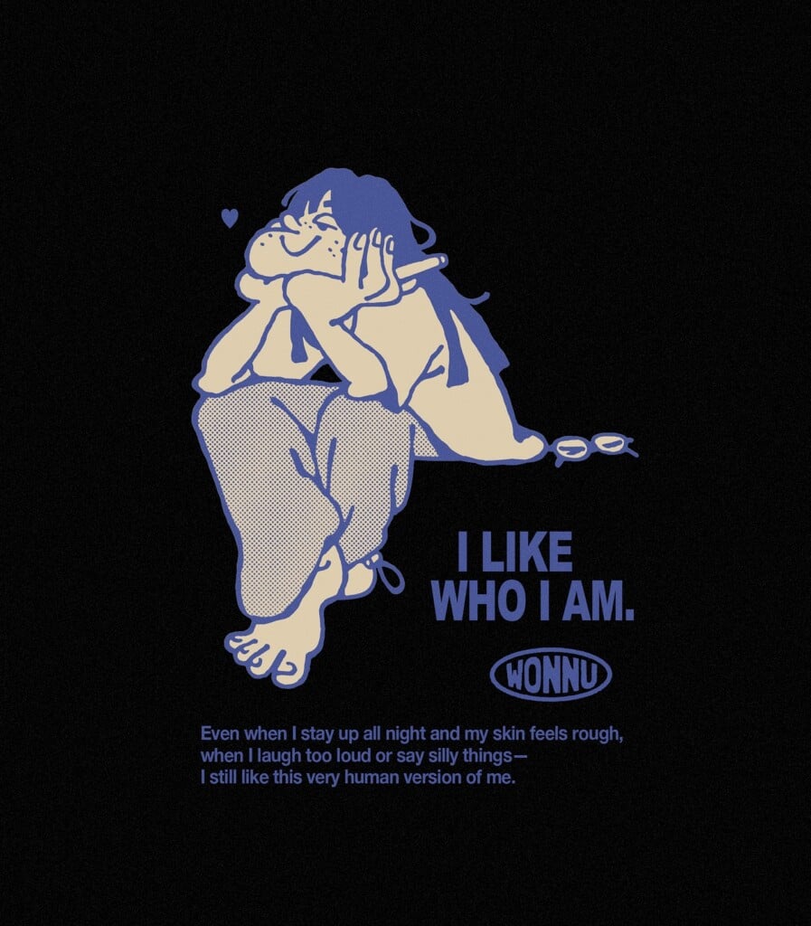
Her work is rooted in clean, direct graphics, where color is used sparingly and shapes remain sharp, without unnecessary decoration.
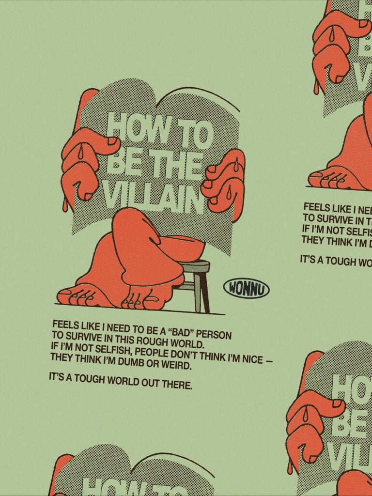
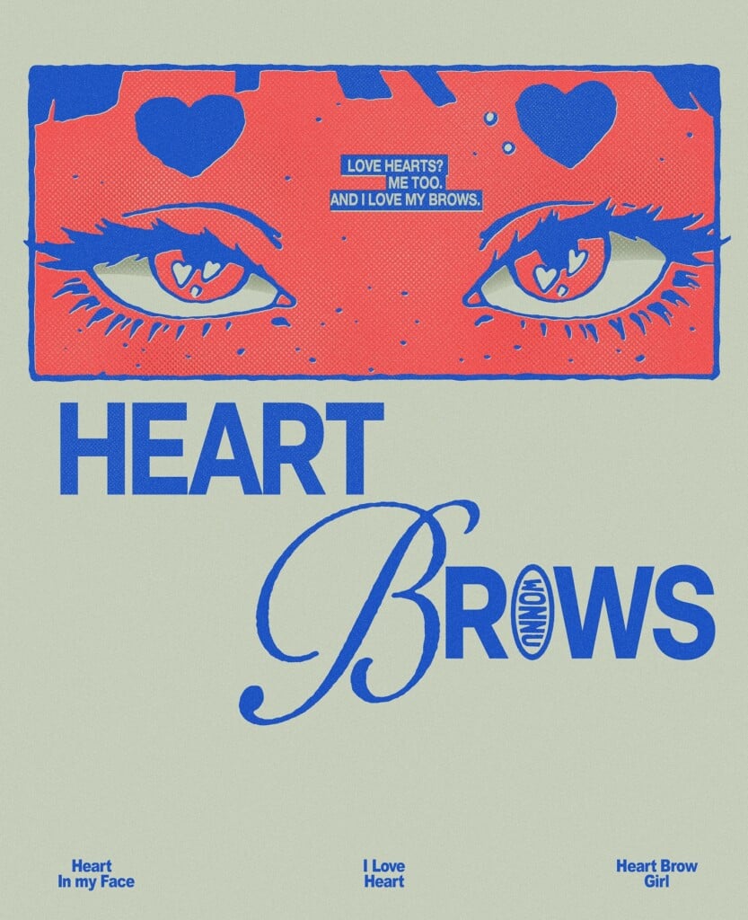
Many of her projects revolve around text, treated as an illustrative element rather than information to be read. Words are tilted, distorted, fitted into shapes, creating a visual rhythm reminiscent of the most recent digital illustration—one that interacts with the languages of the web and social media. It’s a research that remains simple and accessible, yet reveals constant attention to composition and the effectiveness of the message.
Each image created by Wonnu Joke can exist on its own or in series, and all share the same intention: to transform small phrases into images and images into concise statements. A visual practice that moves between poster design, illustrated lettering, and graphic diary, without the need to explain itself in any other way.
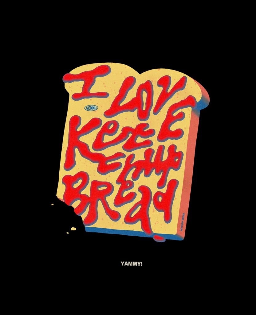
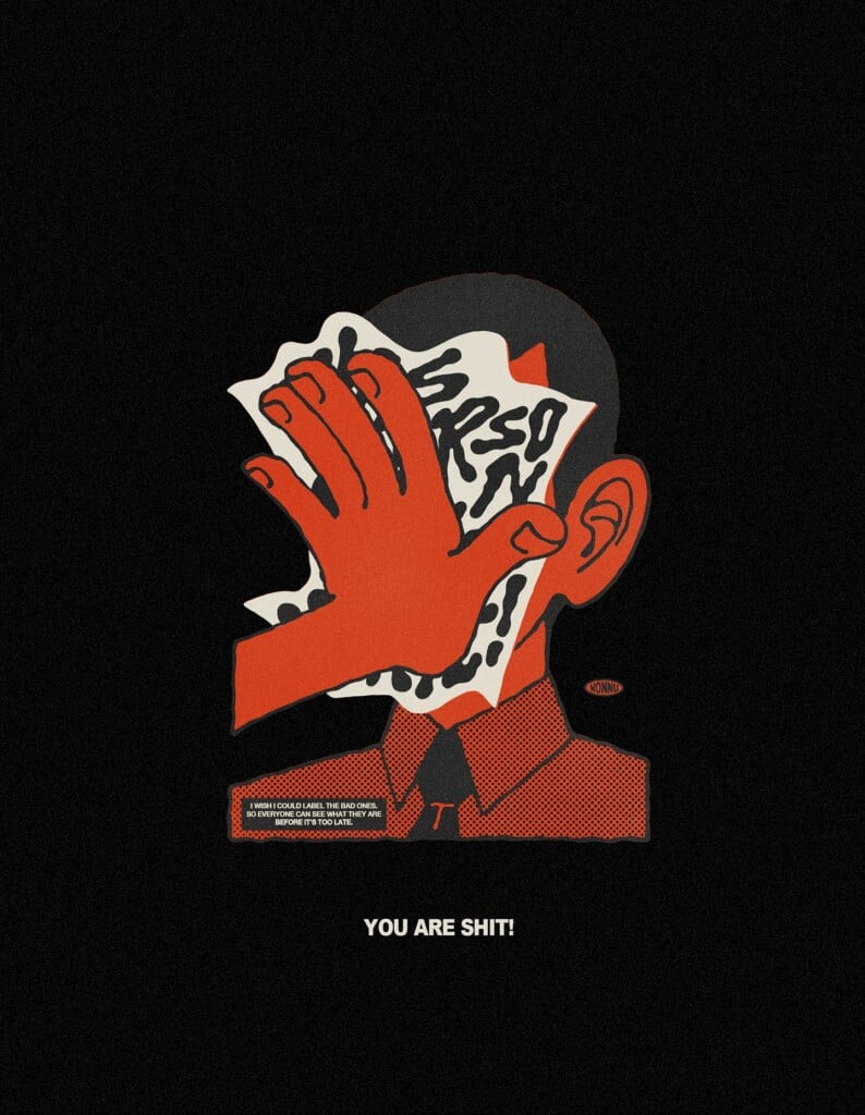
And it’s precisely this clarity that makes her work so compelling: it doesn’t seek complexity or layered concepts, but a direct way of communicating through form. A simple, immediate aesthetic that works well in the digital context and offers a personal perspective on contemporary graphic design.
Leggi anche: Il lettering irriverente di Miguel Prada