There are football jerseys that do more than dress a team—they become a language of their own. They are objects designed to run, endure, and withstand pressure under millions of eyes, but above all they are surfaces where graphics and identity truly meet. Every detail, from the lines to the colors to the patterns, is a deliberate choice, even when it seems invisible.
The various national teams and their respective technical sponsors have recently unveiled their new home and away kits ahead of this year’s World Cup, like Italy’s, which celebrates the country’s traditional tailoring, but while everyone wears a jersey, not every national team is playing the same game.

In fact, the World Cup has always been a design runway too. Some teams have built an identity far removed from their flag, like Italy’s blue or the Netherlands’ orange, now more recognizable than their official colors. Others abandon geometry to work with cultural suggestions, as in the case of Mexico, Portugal, or Japan, and then there are the more direct interpretations, with palettes faithful to the colors of the flag, clean constructions, almost didactic in their clarity, often chosen by Belgium, Nigeria, China, Brazil, Spain, France, or England.
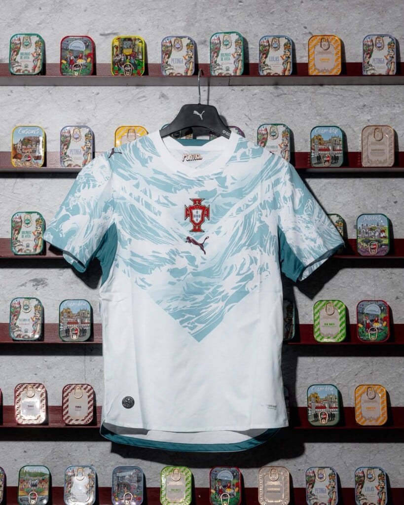
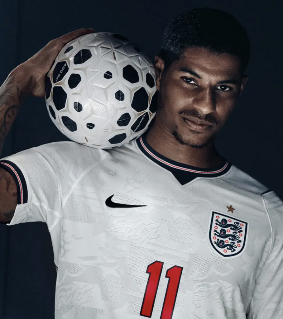
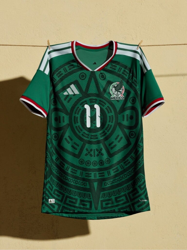
Then there are those cases where everything aligns: flag, design, intuition. That’s when something magical happens. The flag stops being a static symbol and becomes design material—it bends, breaks apart, expands. No longer a fixed sign, but a living element that follows the body and movement.
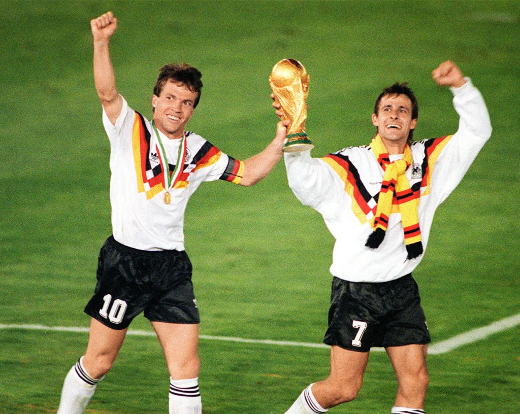
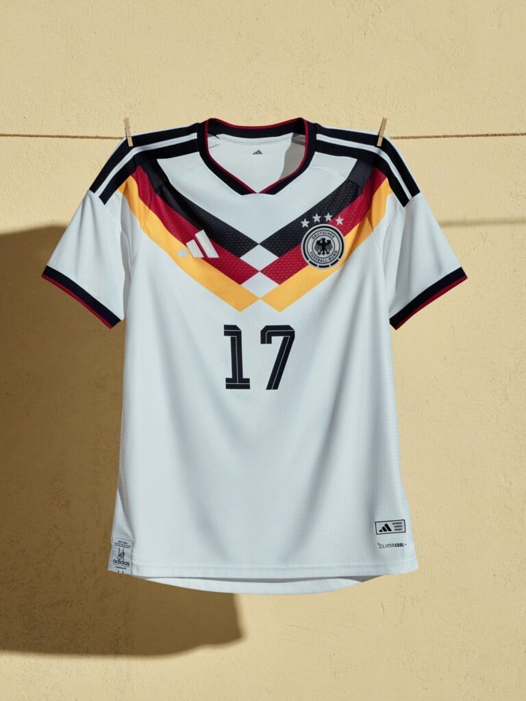
Among all the kits seen throughout the long history of the FIFA World Cup, it is impossible not to mention West Germany’s historic home jersey, worn during the victorious Italia ’90 tournament. Designed two years earlier for Euro ’88 by adidas designer Ina Franzmann, this kit is far more than a sports garment—it is a true style masterpiece that broke away from the minimalism of previous kits. Its graphic signature is unmistakable: three geometric, sharp, fragmented stripes in the black, red, and yellow of the German flag start from the shoulders and cross the chest, pushing upward as a visual representation of victory. A flag reinventing itself.
It is no surprise, then, that this iconic design continues to live on, and the home kit adidas has just launched for the next edition is proof of that.
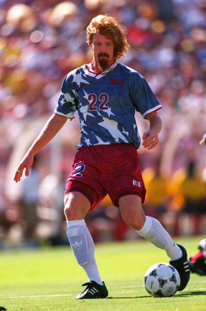
If Germany left an indelible mark by reinterpreting its flag, the United States was no less impactful. Its flag—among the most iconic and recognizable in the world, made up of stars and stripes—takes center stage on the pitch, first with adidas in ’94, and today with Nike for the 2026 World Cup. In both cases, these kits are not just football shirts, they are wearable design pieces that tell the story of a country and its history.
In both editions, the home kit celebrates the stripes, representing the original thirteen colonies. In 1994, the white and red vertical lines ran across the chest in a curved motion, giving the stripes the movement of a flag blown by the wind. Today they return horizontally, more contemporary, but with the same dynamic effect.


The stars, a symbol of American identity, take center stage on the away kits. In ’94 they appeared in white over a denim-style blue background, with red details on the collar and sleeves and the USA crest stitched onto the chest. It was a bold, revolutionary kit that became legendary for its design, perfectly in tune with the ’90s. Today the stars are hidden tone-on-tone on a navy blue base, seemingly essential, but actually holding the cultural multiplicity of the 50 states, transforming every detail into a small visual story.

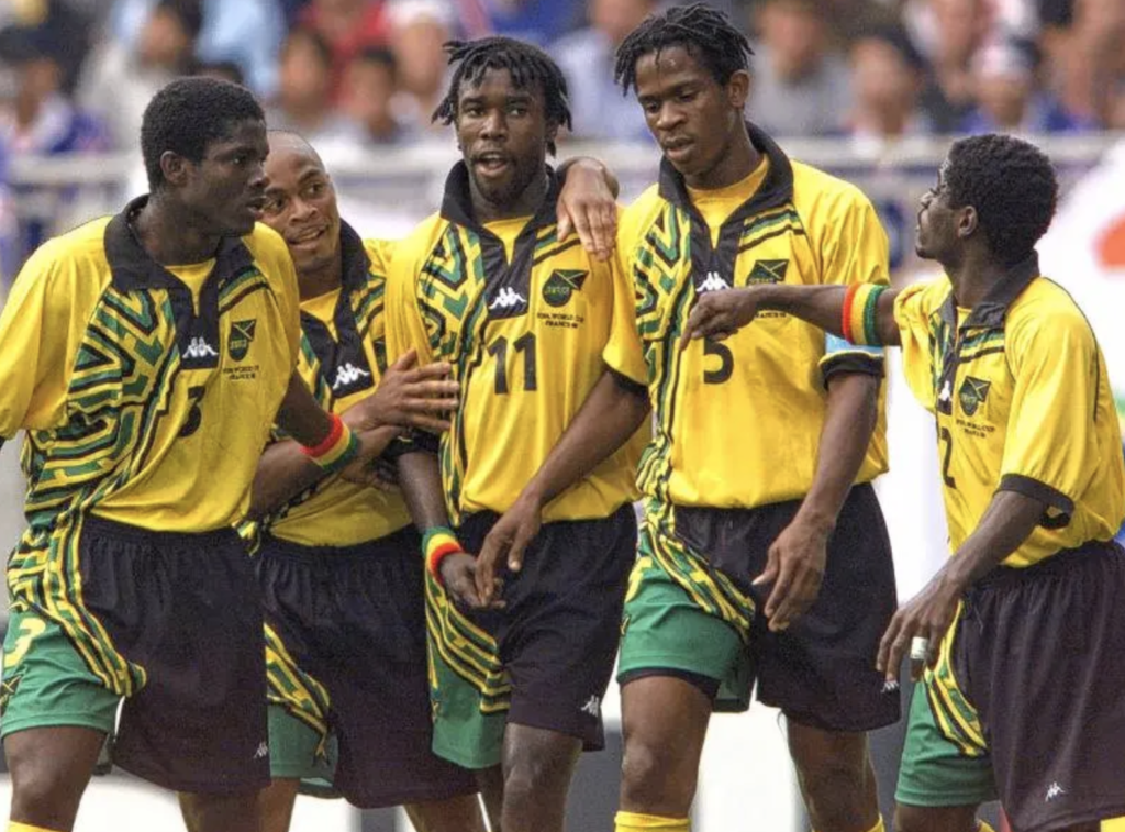
A brand capable of keeping up with Jamaica’s innate creativity was Kappa, which for the Reggae Boyz’ first appearance at the 1998 World Cup in France created one of the most iconic kits ever. The team took to the pitch in an explosive jersey, a mix of color and style that expressed the nation’s boldness, passion, and unmistakable rhythm. The colors of the flag—yellow, green, and black—immediately ignite the visual impact, while the asymmetrical tribal geometric motif running down the right side of the shirt builds a dynamic, contemporary graphic. The result is a powerful reinterpretation of the Jamaican flag, filtered through the vibrant, rule-breaking aesthetic of the ’90s.

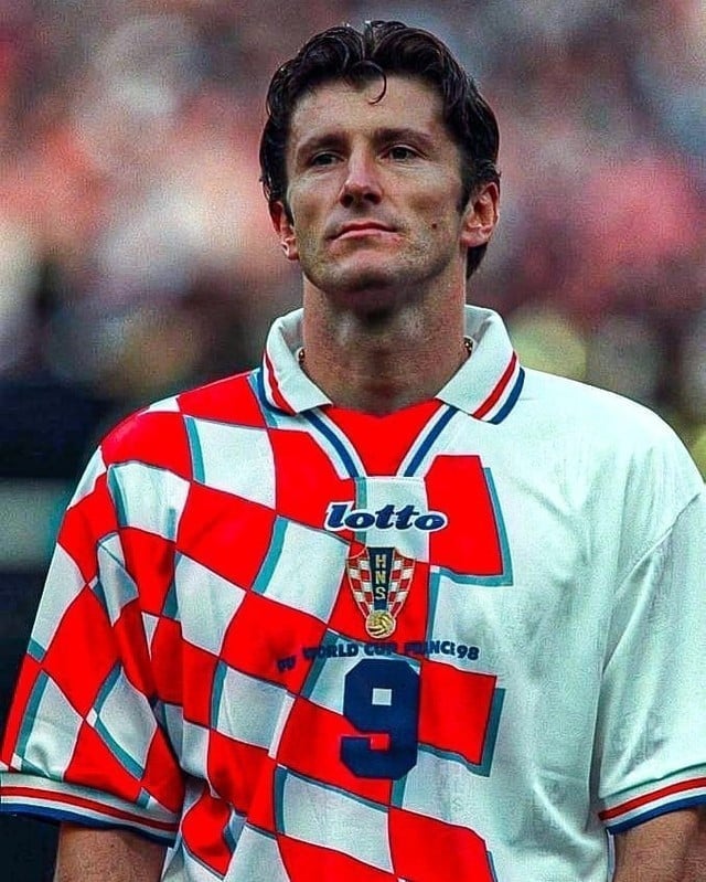
That same edition of the World Cup also saw another debut destined to leave its mark: Croatia. Drawn into the same group as Jamaica, the Croatians took to the field in a kit designed by Lotto that reinterpreted one of the country’s most recognizable symbols in a new way. The iconic red-and-white checks of the flag do not cover the entire surface as tradition would suggest, but are concentrated on the right side of the jersey, where they expand in a dynamic, almost moving composition. The three-dimensional effect, achieved through the gray shadowing of the red squares, adds depth and visual rhythm, while the tricolor red, white, and blue details on the collar and sleeves complete the story with a direct reference to national identity.
In the end, the World Cup is much more than just a game—it is an entire narrative about how a symbol can evolve, adapt, and become something else without losing its identity.
These jerseys do not merely wear the flag—they transform it, deconstruct it, reinterpret it, and set it in motion. It is in this balance between memory and experimentation that design takes shape, giving life to visual identities capable of going beyond the pitch and standing the test of time.