Have you ever thought about how many objects around us could become the subject of an artistic study? Literally anything, like, for instance, stamps.
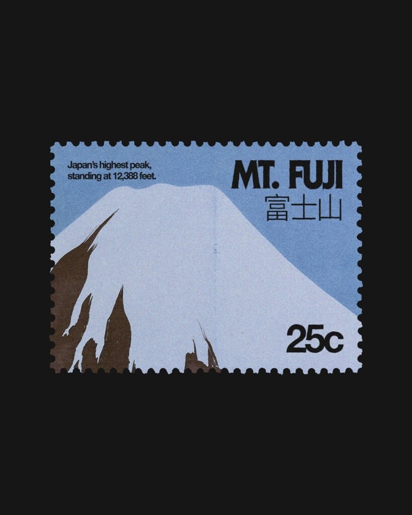
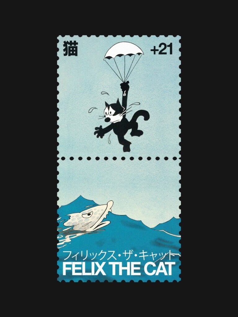
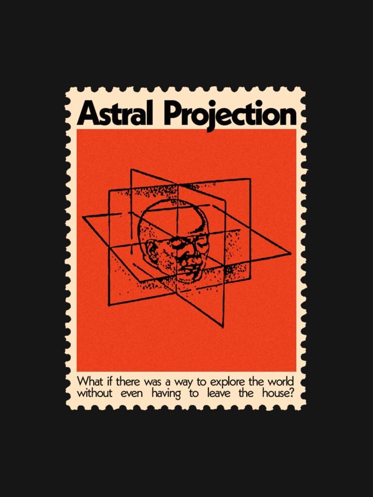
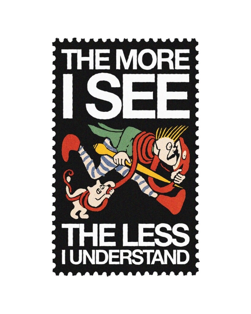
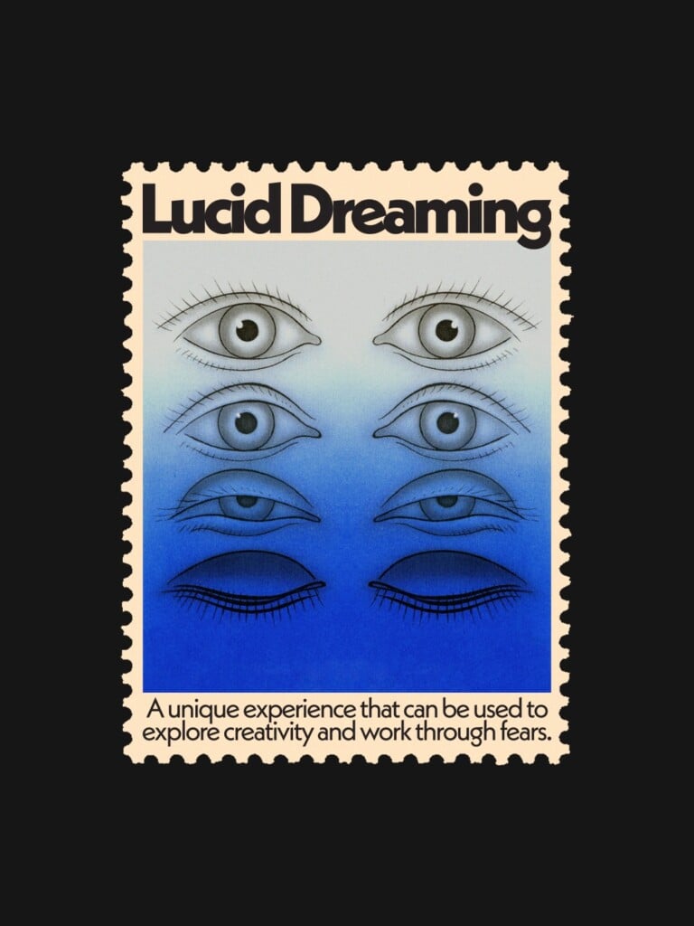
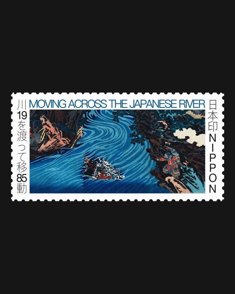
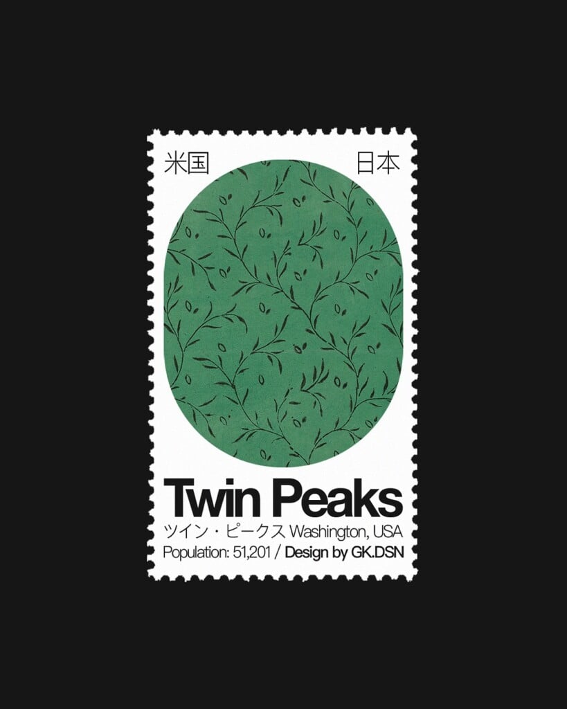
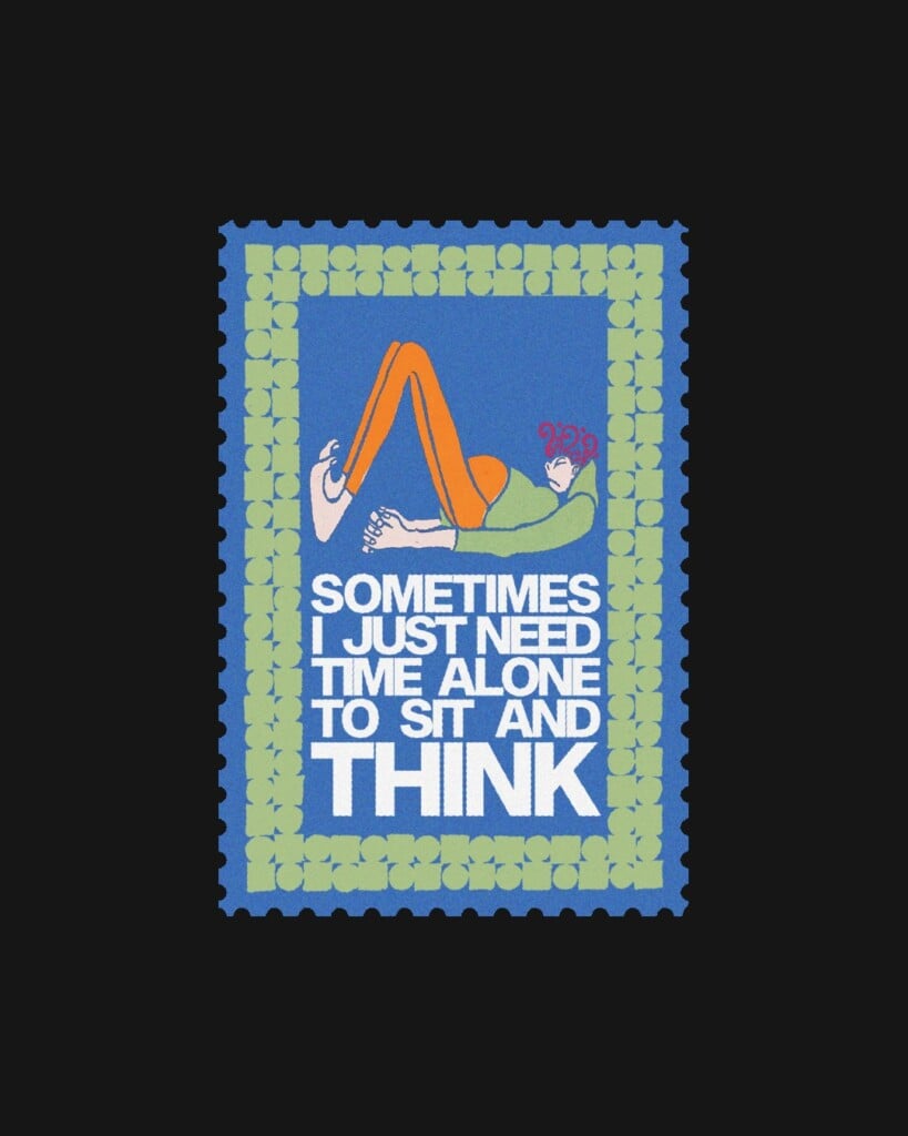
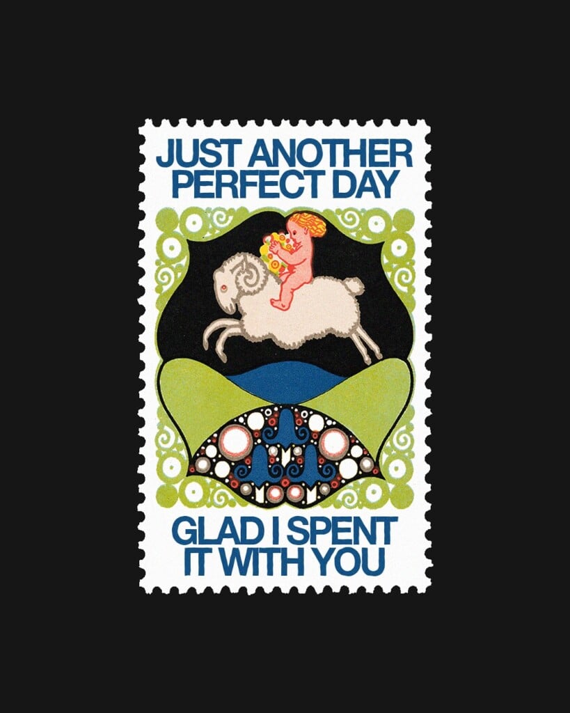
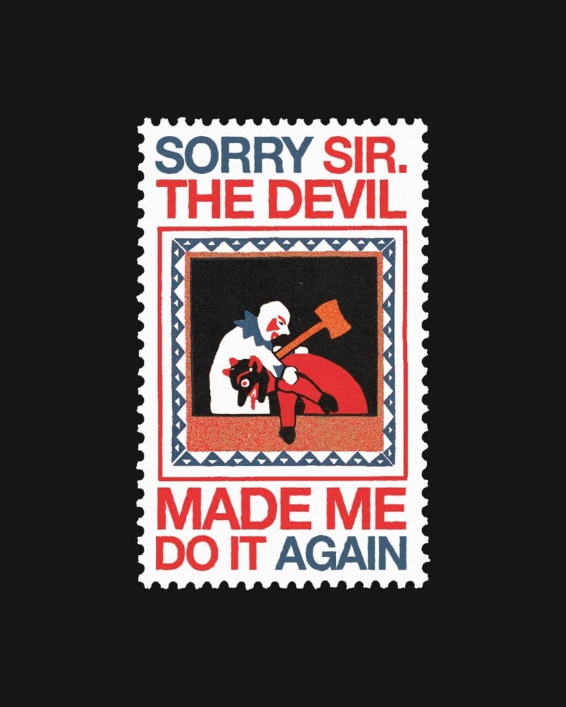
George Kempster knows this well, a graphic designer originally from Manchester, who for some time now has been creating graphics that draw on the style of stamps. Perforated edges, white or black frames, unique subjects, but forget the classic ones: no portraits of monarchs or presidents, no flags or statues. What sets George Kempster apart is his ability to fit an entire world inside something as small as a stamp, from waterfalls running through untouched landscapes to motivational, or simply funny, phrases.
Traditional stamps were born in England in the mid-1800s from an idea by teacher Rowland Hill, who realized that charging the recipient rather than the sender for the cost of sending a letter could backfire. What many people did upon receiving a letter was decide whether to pay for shipping based on who had sent it; Hill proposed always charging a lower price, but to the senders instead. Proof of payment was exactly the stamp.
Since then these small labels have changed in size, shape and style, becoming something we now rarely see and consider tied to a past that no longer concerns us. After all, who still sends postcards or letters by mail these days?!
Perhaps it’s this slightly nostalgic and wistful side that led George Kempster to celebrate the stamp with graphics we’d never want to actually mail to someone, but that we’d love to see hanging on our walls at home.