Spotify‘s new font is set to launch this week on both the app and in the brand’s communications. This operation, which took a full eighteen months, was carried out in collaboration with Dinamo Typefaces, a Berlin-based design studio. The new font, Spotify Mix, will replace Spotify Circular, which has been used for a long time, and is now ready to be set aside in favor of something more versatile.
The Choice of Dinamo Studio
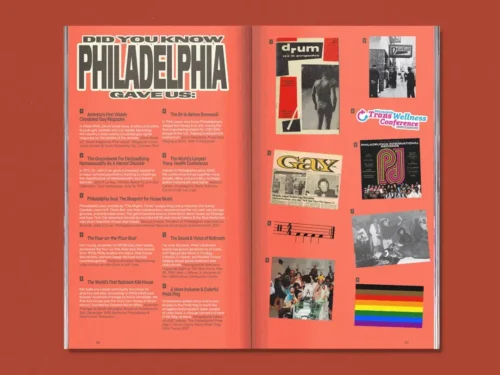
Dinamo Studio has an understanding of music, art, and fashion in the digital context, making them the perfect choice for this project with Spotify. Eighteen months may seem like a long time, but the number of references from music history was immense, and there was a lot of work to be done. Posters, album covers, and a lot of other materials were incorporated into the final result, also influenced by dance and movement.


The Final Result: Spotify Mix
The outcome of this change involves a new balance between expressiveness and character, taking into account the importance of issues like readability and accessibility. The more we look at Spotify Mix, the more we notice details that make it different from all the others. The most recognizable component is probably the shape of the so-called transmitter in the negative spaces of letters like “p,” “b,” and “d,” designed to reference audio amplification. On the other hand, there are also subtler details, such as pen strokes and diagonal cuts, that give the font a distinctive look and add character and personality.