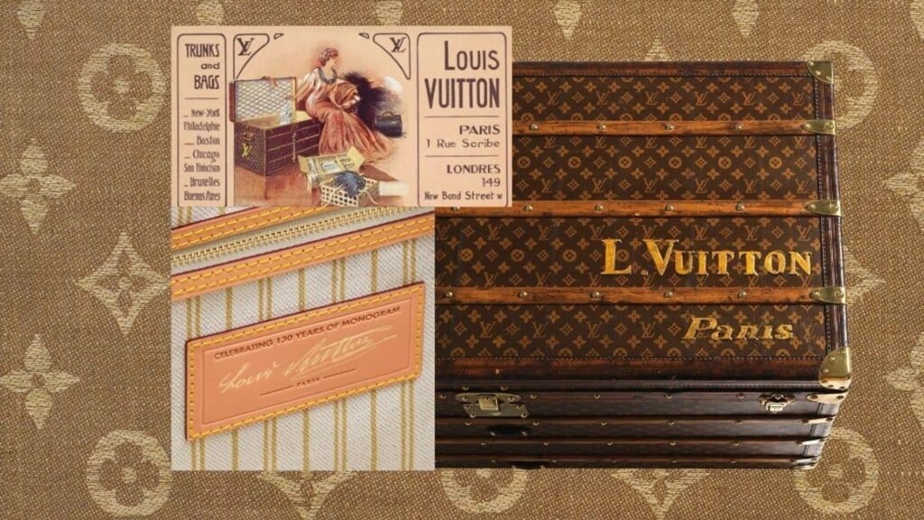
For 130 years, the Louis Vuitton monogram has been more than a pattern: it’s a complex graphic system—instantly recognizable and surprisingly elastic. Created in 1896 by Georges Vuitton, the monogram was conceived from the start as a dual device: a visual signature and an anti-counterfeiting tool. At a time when imitations were already a real issue, Georges chose to “sign” every object with his father’s name, turning the mark into a guarantee of authenticity even before it became a decorative element.

From a graphic standpoint, its strength lies in its construction. The interlaced LV initials coexist with floral motifs and quatrefoils, creating a modular, continuous surface designed to repeat without ever losing balance. A visual language that draws as much from neo-Gothic ornamentation as from Asian visual codes (especially Japanese), recognizable in the symmetry, stylization, and the tension between rigor and decoration. Not a simple pattern, but a true architecture of the sign.
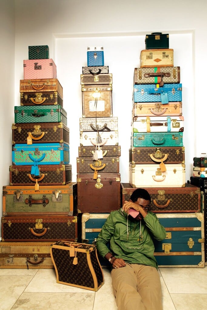
Traditionally printed on coated canvas and finished with natural leather, the monogram has accompanied trunks, luggage, and leather goods for over a century. It was born for travel trunks and absorbs their values: resilience, solidity, durability—but also an openness to other cultures and imaginaries. It’s a pattern that communicates movement and continuity, designed to be recognized from a distance and on the move.
Over time, the monogram stopped being just a covering and became a cultural language. It changes scale, gets deconstructed, overprinted, reinterpreted—without ever losing legibility. As early as 1996, for its centenary, Louis Vuitton opened the code to a plurality of designers, invited to reinterpret it on one-of-a-kind luggage pieces: a key moment that marked the monogram’s definitive shift from proprietary symbol to creative platform.
With time, however, the monogram stopped being just a surface and became a platform. From the 2000s onward, the LV code was definitively opened to artistic reinterpretation, turning into a field for graphic experimentation. In 2003, Takashi Murakami subverted it chromatically: the monogram exploded into a pop palette, shedding its historic monochrome and multiplying into dozens of colorful variations—bringing Louis Vuitton closer to an openly contemporary, global imaginary.

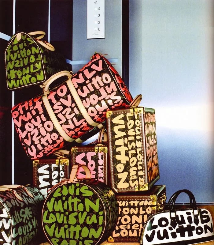
Soon after, Stephen Sprouse stepped in with a radically different gesture: the monogram was covered, crossed, almost vandalized by graffiti lettering. Here the sign is no longer simply celebrated, but put under tension—contaminated by an urban aesthetic that breaks with the idea of untouchable luxury. A graphic operation that introduces the concept of visual stratification and the conflict between an institutional code and a spontaneous gesture.
In the following years, the collaboration with Supreme marked another pivotal shift: the monogram entered streetwear language in full, becoming a symbol of a new kind of cultural legitimacy. No longer just heritage, but a fluid sign—able to move between fashion, art, and visual subcultures without losing recognizability.
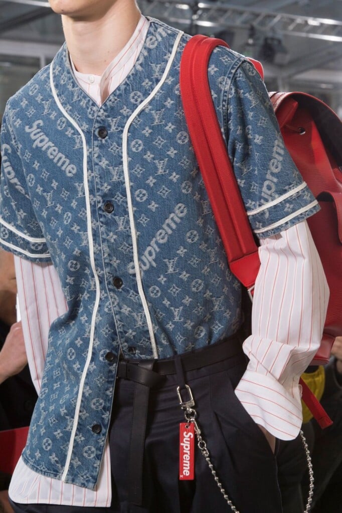
More recently, Yayoi Kusama dissolved it into obsessive polka-dot patterns, while Virgil Abloh reread it through a conceptual and typographic filter, playing with scale, transparency, and layering. In both cases, the monogram isn’t replaced, but questioned—treated as living material.
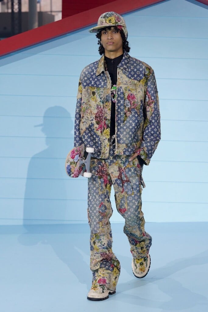

With the arrival of Pharrell Williams as Louis Vuitton’s Men’s Creative Director, the LV monogram has continued to stand out. Pharrell has dismantled and reassembled it, transforming it into pixelated patterns, maxi-grids, chromatic camouflage, and almost digital surfaces—where heritage and street culture coexist in harmony.

After 130 years, the LV monogram still works because it was never just decoration. It’s a solid graphic structure, born to solve a concrete problem and later becoming an open language—able to absorb history, technique, and contemporary visual culture. An example of design that doesn’t age, but stays strong through the layers and evolutions that keep it current.
Read also: Is logomania really in decline?