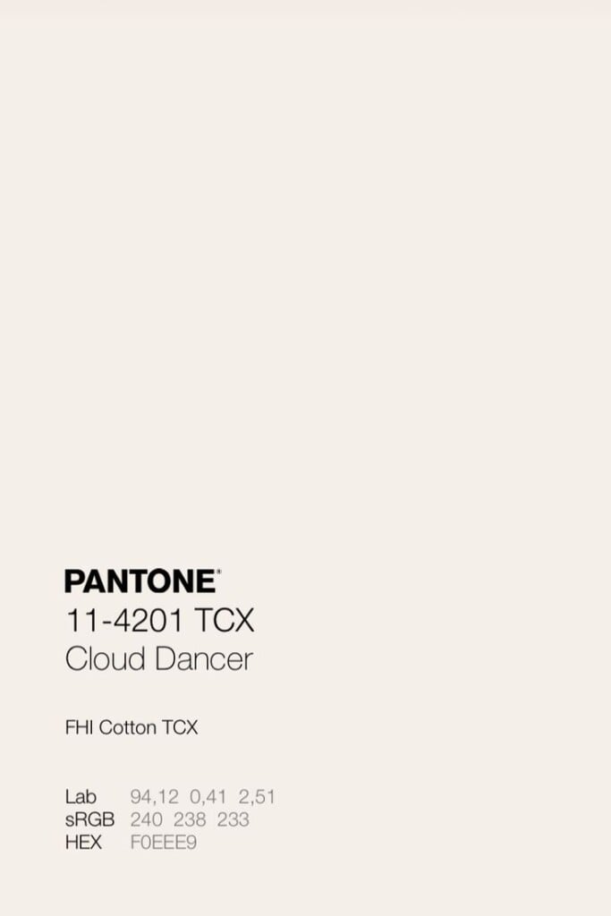
This year Pantone chose a white. Cloud Dancer, the new Color of the Year, is in fact the first bright shade ever named by the Pantone Color Institute, a choice that immediately evokes the idea of a reset, a clean page, a sort of collective “refresh.” Last year Mocha Mousse had already sparked discussion – and we talked about it here. Scrolling through the comments under this year’s announcement post, you can sense a widespread feeling of disappointment. We also asked ourselves what the point is of predicting a Color of the Year every year, and whether this tradition still carries the same narrative strength as it once did.
Visualizza questo post su Instagram
According to Leatrice Eiseman, Executive Director of the Pantone Color Institute, Cloud Dancer represents an openness of mind, a gateway toward “new paths and new ways of thinking.” It’s a white that doesn’t overwhelm but invites. That doesn’t impose, but prepares. Not by chance, Eiseman describes it as “a whisper of calm in a noisy world,” a perfect image for a shade that rejects any visual urgency and instead chooses subtraction.
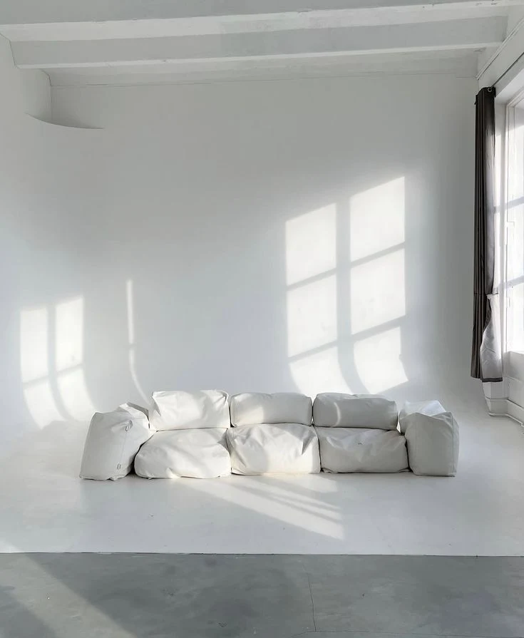
White, in decoration, has always been the ultimate neutral, the zero point from which any atmosphere can be born. But announcing a white as Color of the Year, in a global context where “white” carries political tensions and uncomfortable references, might raise an eyebrow or two. Pantone, however, keeps it simple: “Skin tones had no bearing on the choice,” says Laurie Pressman, Vice President of the Pantone Color Institute. “For us, at the most essential level, it’s about understanding what people are seeking and how color can try to respond.” The white of Cloud Dancer is not an identity statement, but an emotional invitation. Not a political symbol, but a collective need.
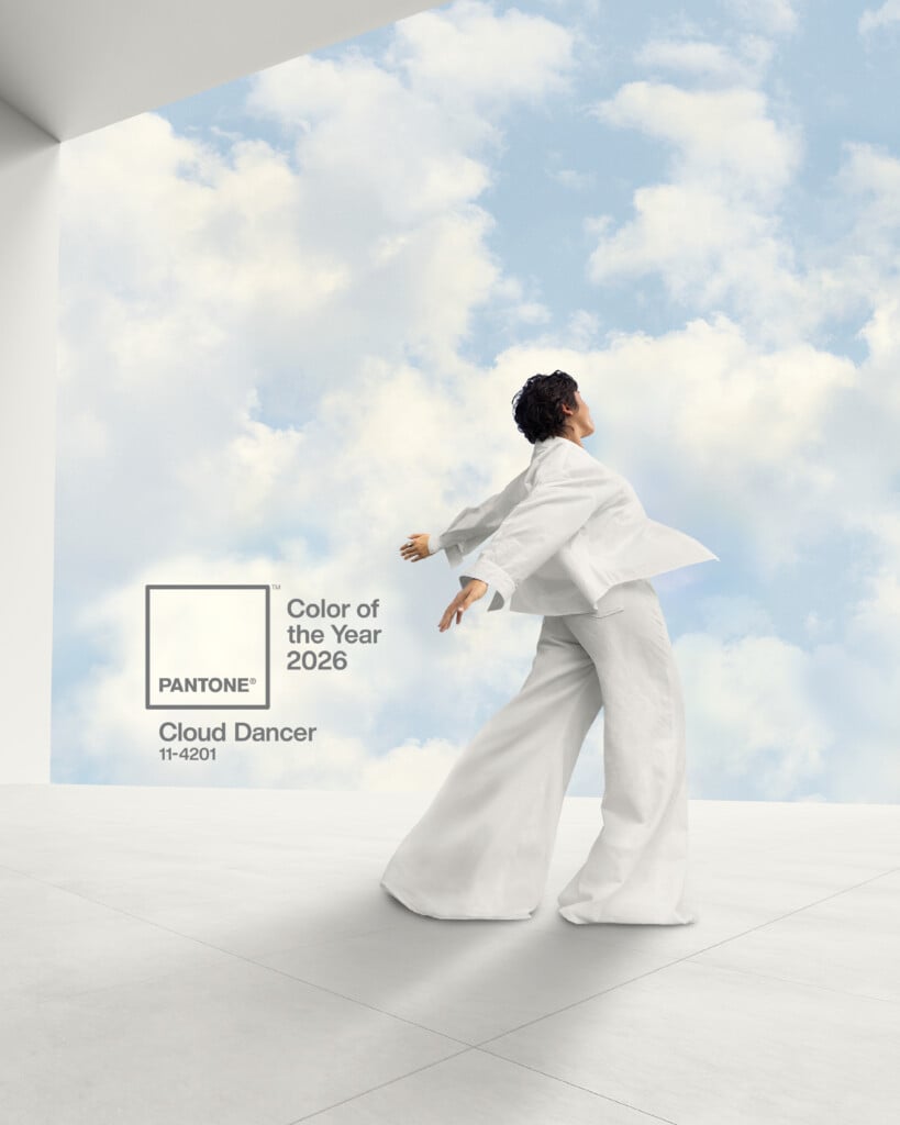
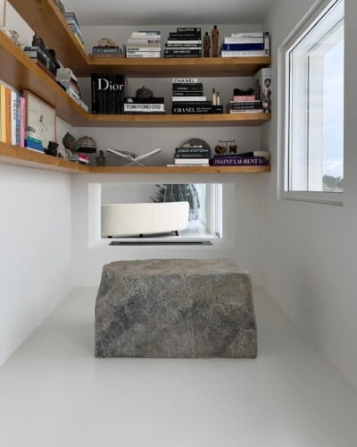
Cloud Dancer, officially Pantone 11-4201, aims for a return to simplicity that does not fear its own fragility. Far from the sharp minimalism of the ’90s and the cold whites of recent tech aesthetics, this white is soft, almost intangible. It does not want to erase, but to welcome. It suggests, then, that in the chaos of hyperstimulation, the answer might indeed be subtraction — making room.

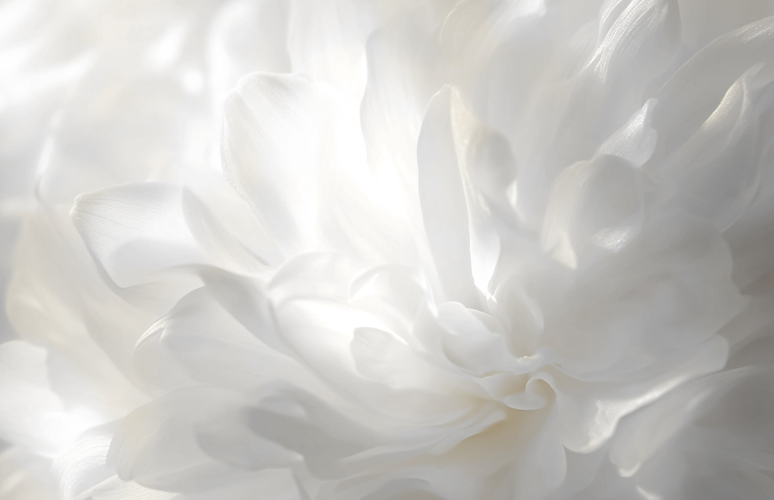
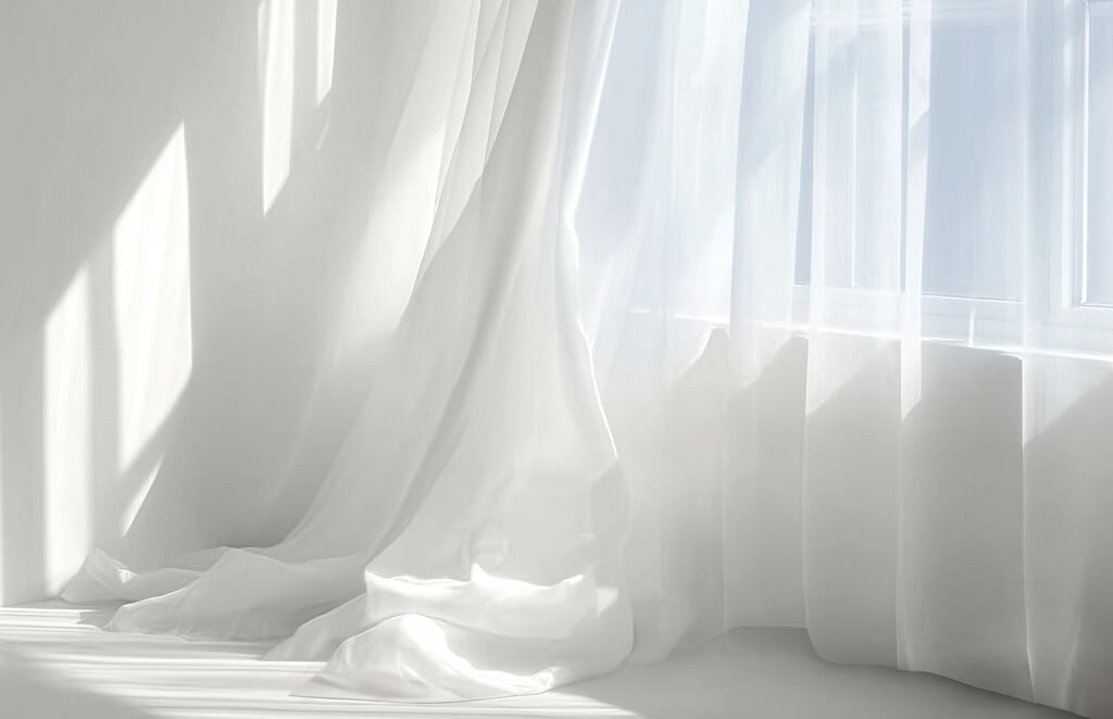
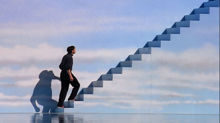
The images and videos that accompanied the announcement of the new Color of the Year made us think of The Truman Show: the story of a constructed, seemingly perfect world where everything is controlled and from which, in reality, there is no escape. A decidedly bizarre association, recalling an over-controlled dimension — in stark contrast to Pantone’s imagined idea of welcome and subtraction — but one that at least pushes us to reflect on the very meaning of “Color of the Year.”