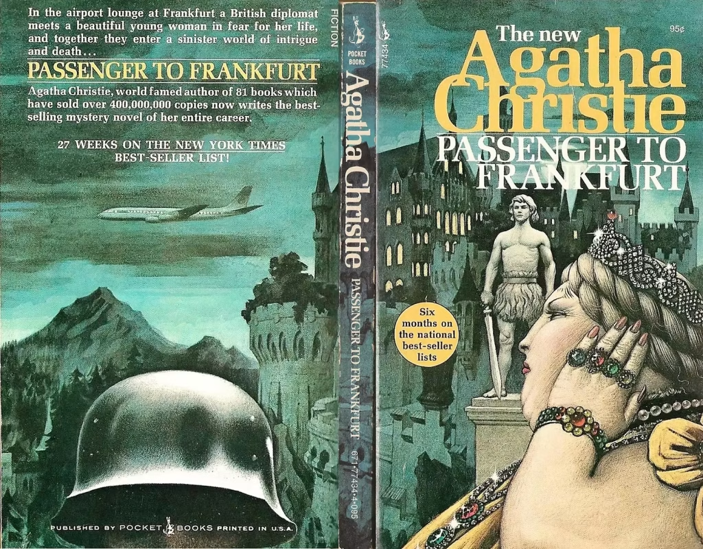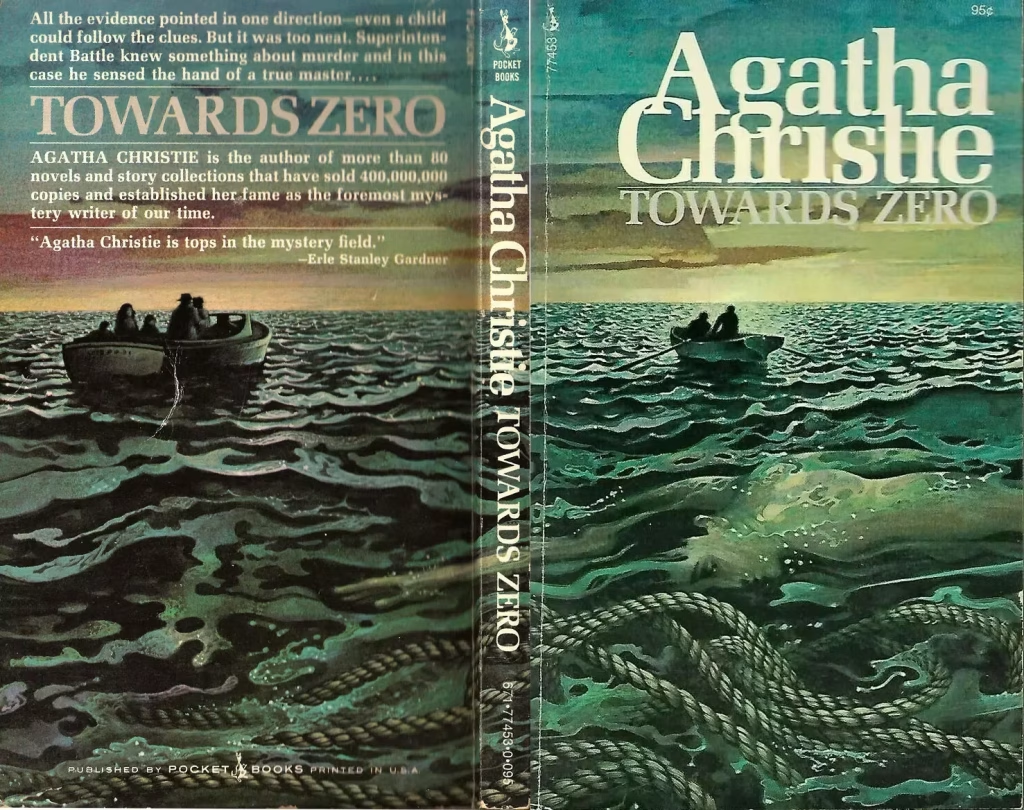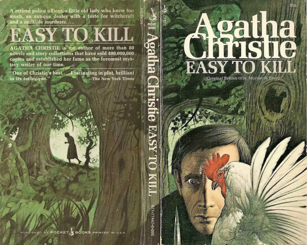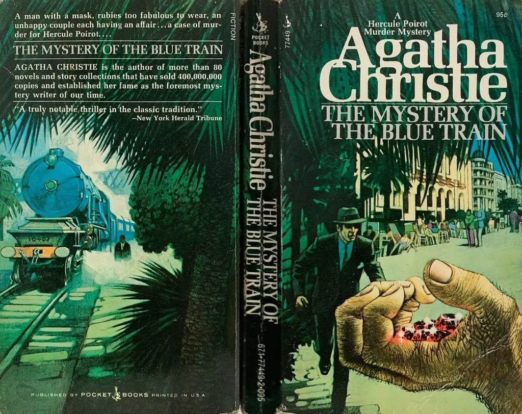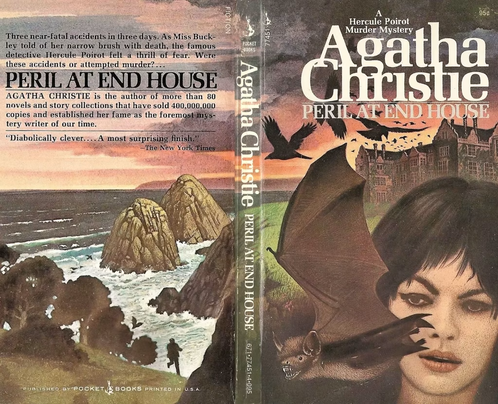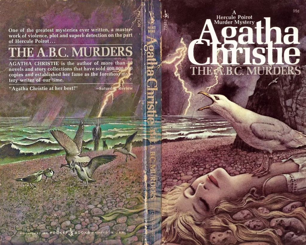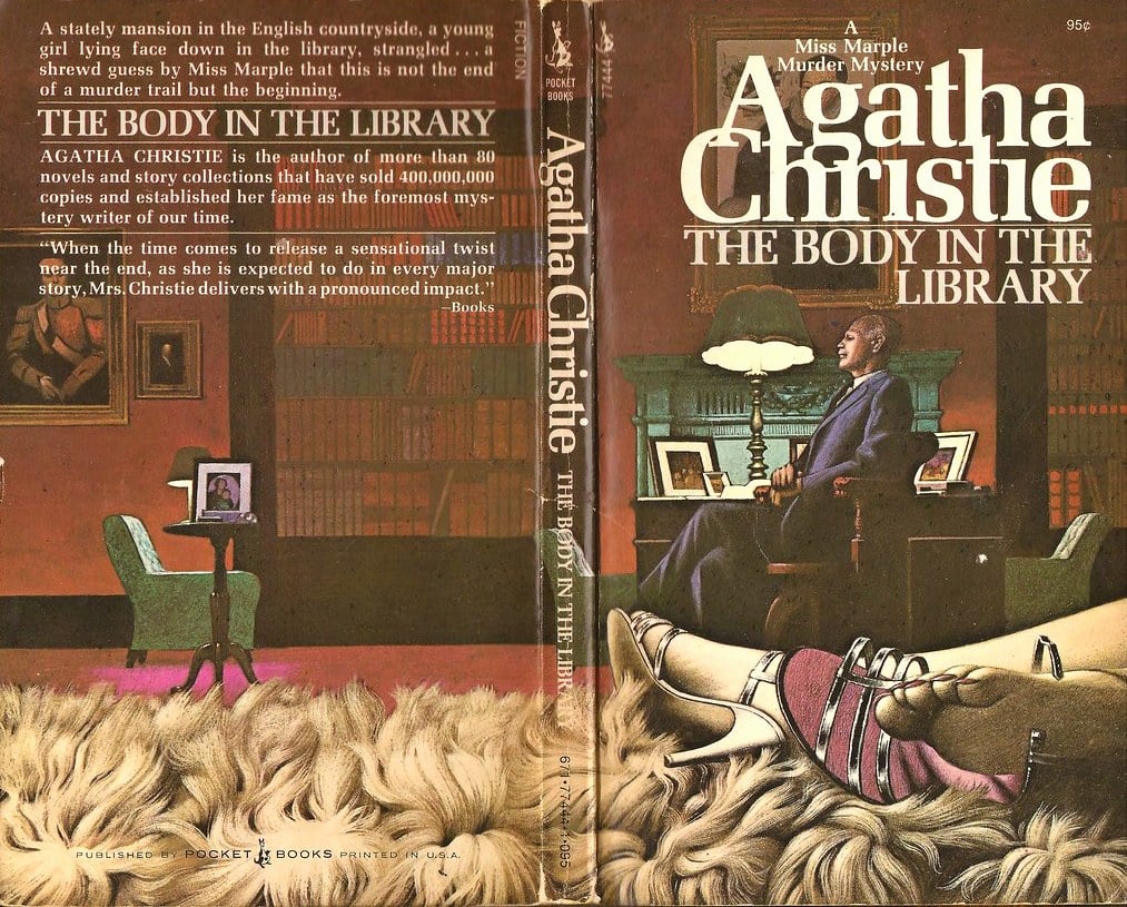
When discussing the visual imagery of Agatha Christie in the second half of the twentieth century, the name of British illustrator Tom Adams emerges as an indispensable presence. Adams was able to reinvent the book cover as a space of interpretation, tension, and ambiguity. Through his illustrations for the Fontana paperback editions in the United Kingdom and Pocket Books in the United States, Adams played a decisive role in shaping a new iconography for the “Queen of Crime,” one that would profoundly mark the visual memory of generations of readers. On the occasion of the 50th anniversary of the writer’s death, who kept the entire world in suspense, we decided to revisit her masterpieces through the work of Tom Adams.
When Adams began working on Agatha Christie’s covers in the early 1960s, the author was already a global phenomenon. Her novels had spanned decades, wars, and social transformations, adapting to the new formats of mass publishing. One of the most significant changes was the introduction of flexible covers, and thus of pocket editions, or paperbacks. This innovation created a new necessity: to make texts that had by then become “classics” feel contemporary.
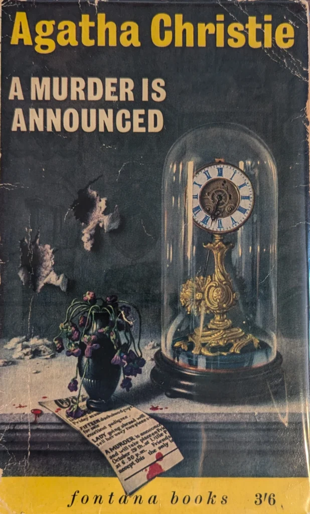
It was within this context that the publishing house William Collins & Sons—the forerunner of today’s HarperCollins—through its Fontana imprint, decided to commission Tom Adams, impressed by his ability to create evocative and unconventional images.
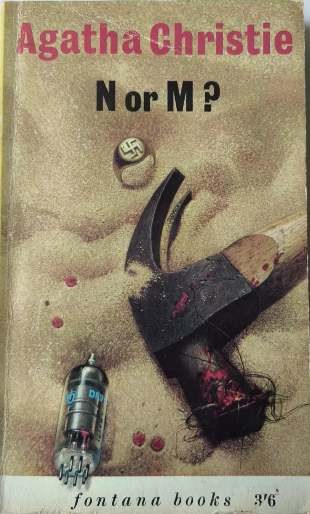
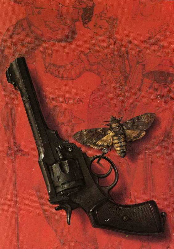
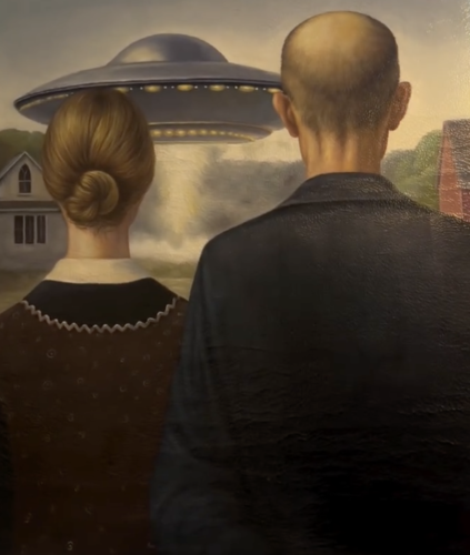
Tom Adams, in fact, constructed images dense with symbolism, often unsettling, in which objects, fragments of bodies, animals, or surreal landscapes became visual clues rather than explicit narrative elements. His style blended surrealism, pop art, and a strong psychological component, rejecting literal illustration.
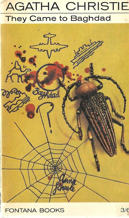
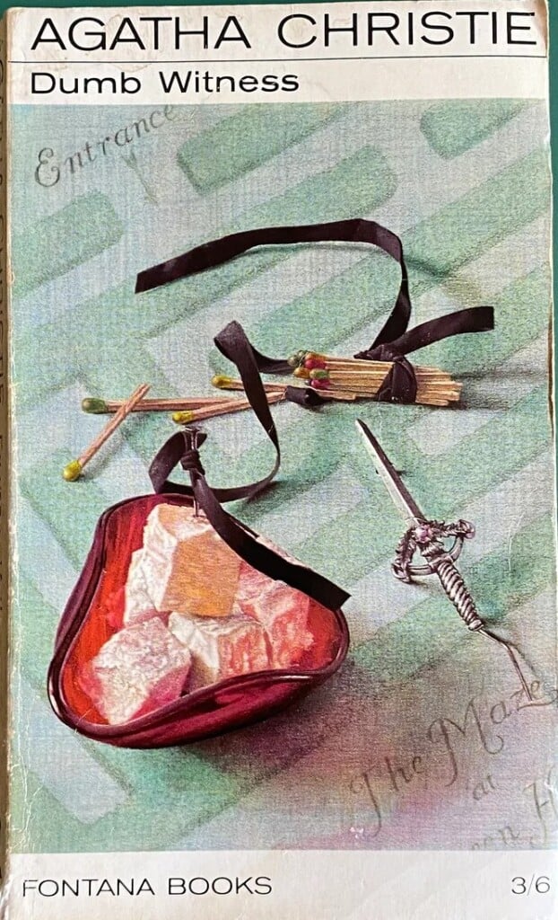
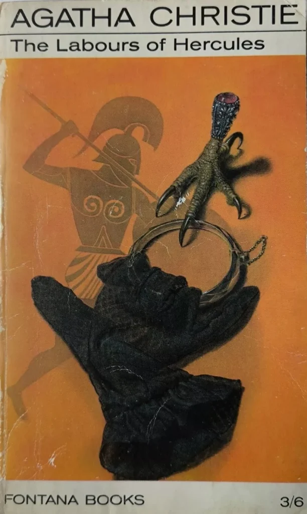
A key choice in his approach was the systematic refusal to depict Hercule Poirot or Miss Marple, the famous characters created by Agatha Christie. According to Adams, these figures were already firmly fixed in the collective imagination of readers, and any attempt to represent them would have diminished the evocative power of the text.
Instead, he chose to use the covers to give space to objects—very often three of them—and to create compositions resembling collages. These covers offer neither solutions nor previews, but rather pose questions and invite the reader to dive into the pages. They functioned as visual enigmas, like rebuses.
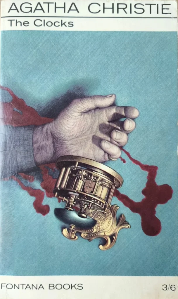
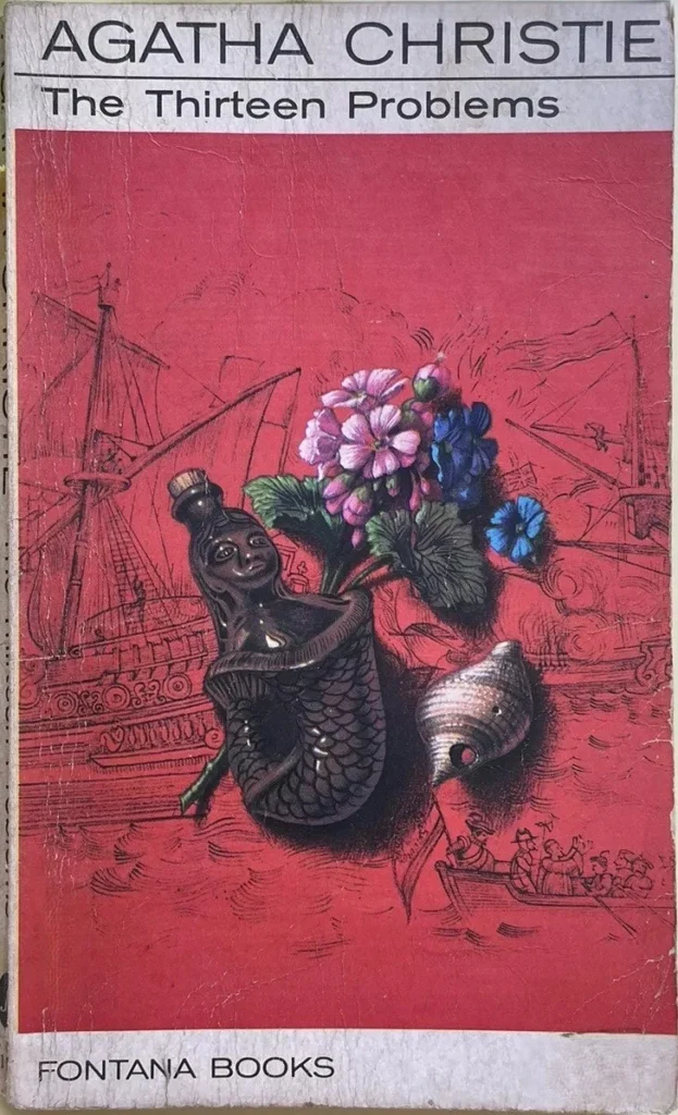
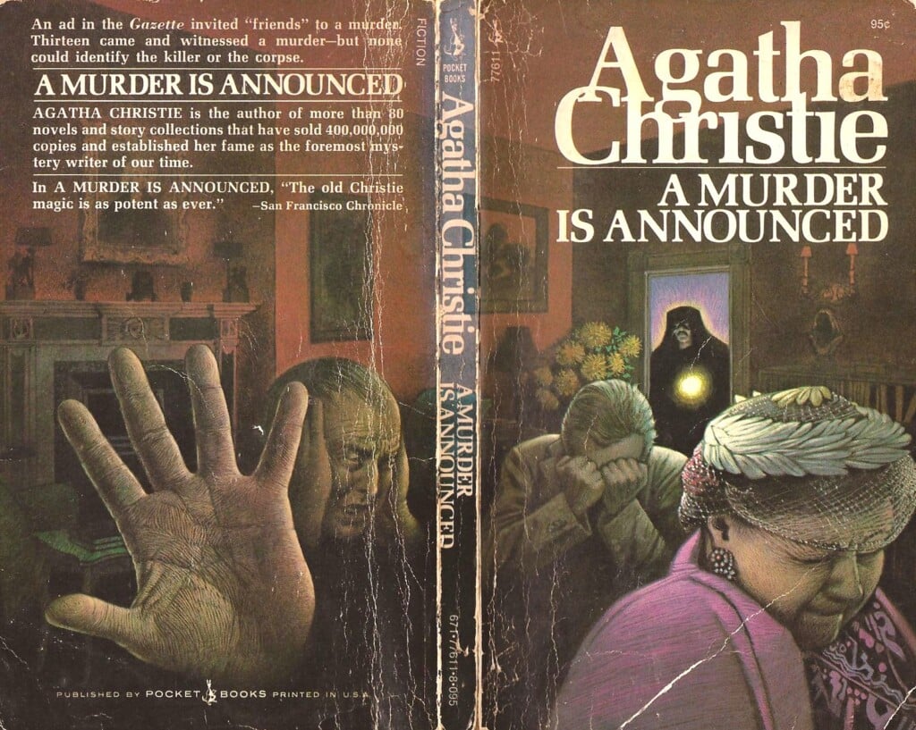
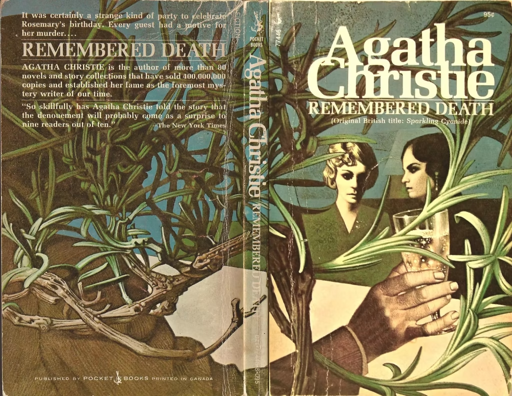
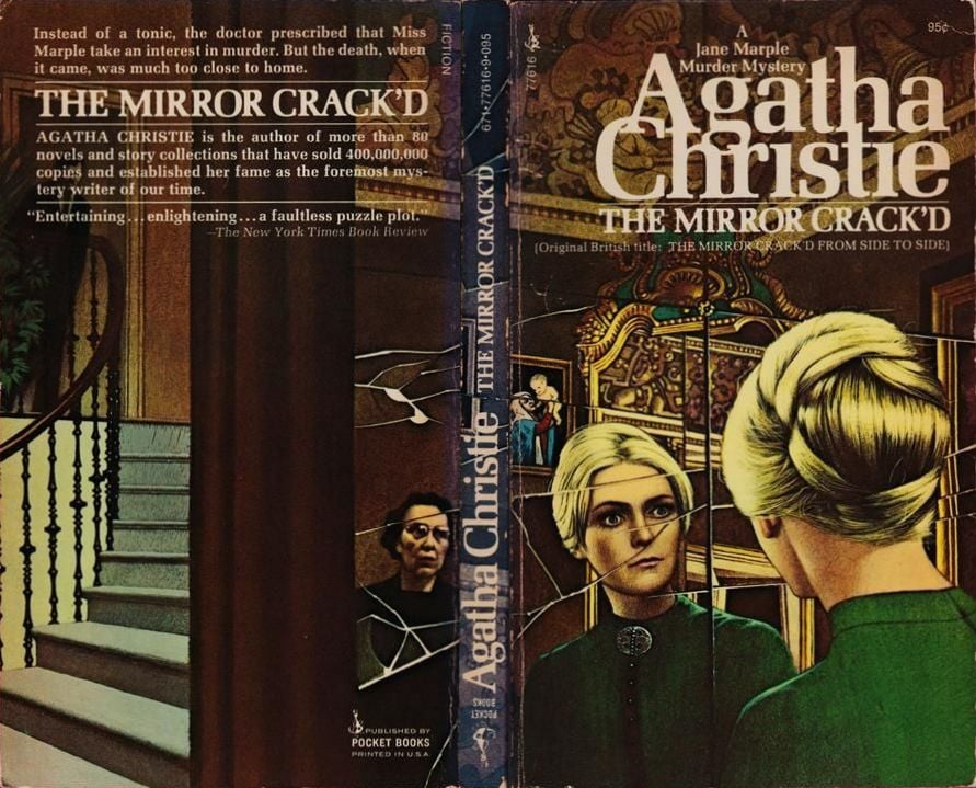
Then, between 1971 and 1974, it was Pocket Books that commissioned Adams to produce as many as 26 covers for the US market, and once again his visual language adapted to new editorial requirements. The American publisher, in fact, favored a more realistic and narrative aesthetic, capable of attracting a broad audience accustomed to greater visual clarity.
The result was a series of wraparound covers, in which the image extends from the front to the back cover, creating a single, continuous scene. Although more figurative than the Fontana editions, these illustrations retain Adams’s distinctive signature: a constant sense of suspension, ambiguous details, and an atmosphere charged with foreboding. Here too, the image does not solve the mystery—it sets it in motion.
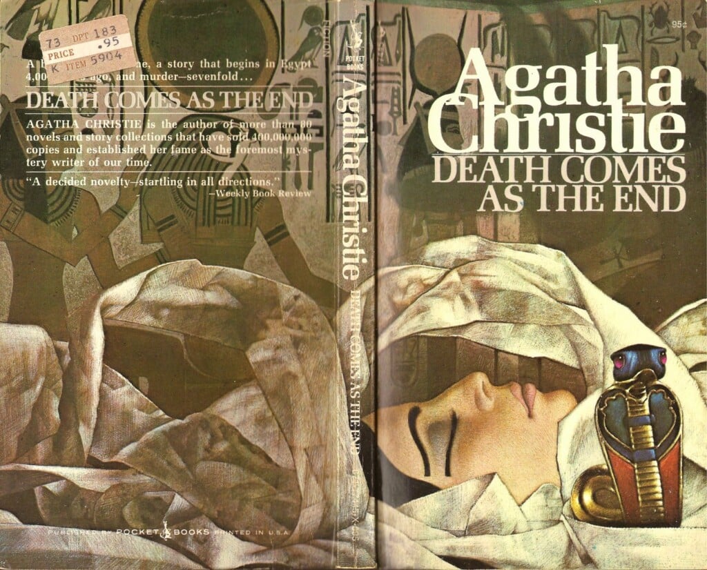
We are always told not to judge a book by its cover, but in the case of Tom Adams’s covers, it feels right to make an exception.