Coca-Cola has launched its sensational new advertising campaign.
The renowned carbonated drinks multinational is one of the companies that manages to get away with little when it comes to communicating its message.
Not so long ago McDonald’s also created a similar campaign, with only the font of the same company in which any kind of image was absent.
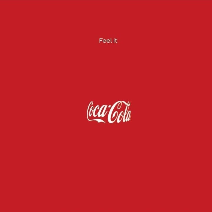
As can be seen from this new campaign created by Publicis Italia, the agency uses nothing but the brand’s red and white palette, making full use of the logo that anyone has seen at least once in their life.
The advertising of Coca-Cola will be reproduced only in public advertising spaces and in print.
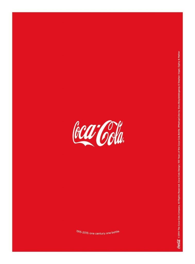
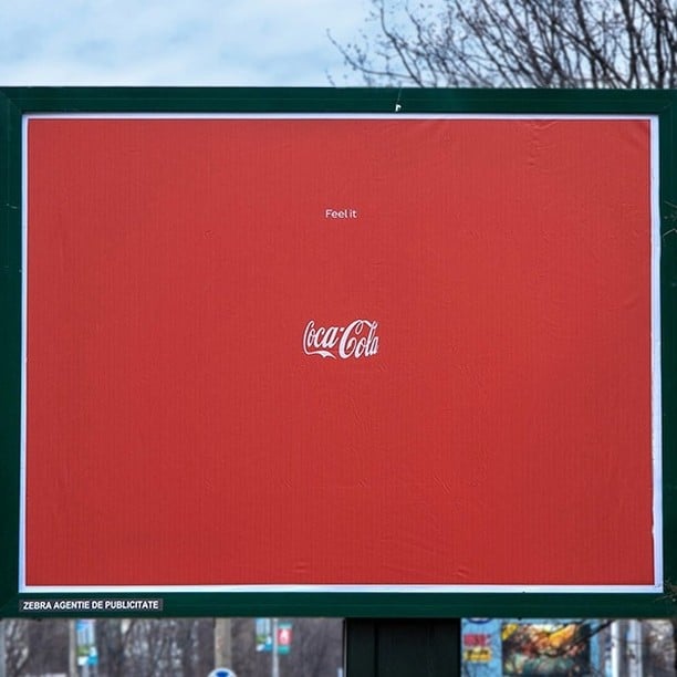
The white logo on a red background curves softly as if wrapped around the shape of the iconic bottle, and a two-word phrase that sums up the meaning of the campaign: “Feel it“.
The distance between the two lines of text makes it seem as if there really is a real bottle, creating a nice and ingenious optical illusion.

We called it a simple and ingenious idea, but apparently Stephan Vogel, chief creative officer EMEA of Ogilvy, claimed paternity with a post on Publicis Worldwide’s facebook profile (which was later removed).
In 2015 the famous Ogilvy agency had created the same image for the “birthday” of the bottle celebrating its 100th anniversary.
A campaign that had even won a gold medal at the London International Awards, which is why it seems very difficult that such an idea could be forgotten.
Today, meanwhile, the first denials from Publicis Italy and Coca-Cola arrive with a short and joint statement.