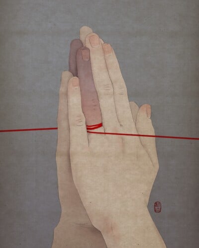
You may have seen some of his illustrations on the pages of the GQ or the New York Times, on the covers of books or posters of film festivals, because the style and beauty of Sébastien Plassard‘s illustrations have made him internationally known and you will inevitably fall in love with him too.
His works are recognizable among thousands, thanks to a unique style that combines the modern and elements reminiscent of the old advertisements of the ’50s. What it represents is what surrounds us every day between sunsets and means of transport, between cars and planes but always with what I don’t know that makes the result almost surreal.
Sébastien plays with lines and colors, creating points of light with tones like orange and creating shadows with tones that change from blue to gray.
Even the technique he uses combines new and old. The French illustrator always starts his work on paper and then goes to the computer to work mainly on textures.
Discover other Sébastien’s works on his site and on Instagram.