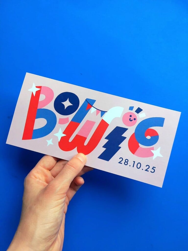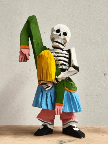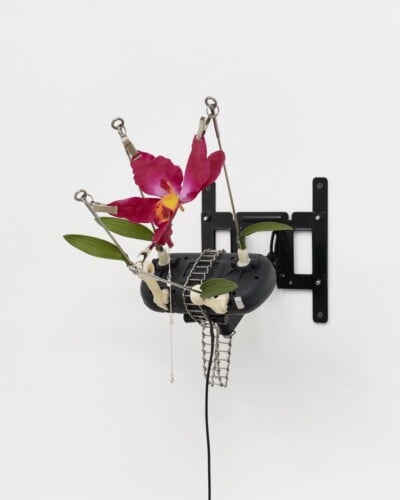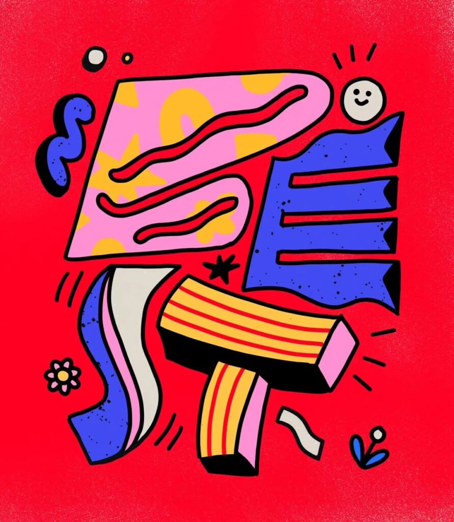
Lienke Raben’s lettering is never just typography, but becomes a narrative space where letters, shapes, and color coexist on the same plane. The Dutch illustrator creates compositions in which text stops being a functional element and transforms into a dynamic and playful visual presence.
Her letters move within a visual language made of soft geometries, patterns, and vibrant color palettes. There is no rigid hierarchy between typography and illustration: words become objects, shapes bend to accommodate the text, and color creates rhythm and depth. The result is lettering designed to be explored rather than simply read.


Raben draws from everyday imagery, interior design, architecture, fashion, and even nature, translating these influences into accessible and immediately readable compositions, even when dense with elements. This balance between clarity and experimentation is one of the most recognizable aspects of her approach.

In contrast to traditional neutral palettes, Raben creates colorful compositions filled with soft shapes, where every word becomes the center of a small visual universe. Lettering thus transforms into a unique medium, rather than simply a graphic solution.

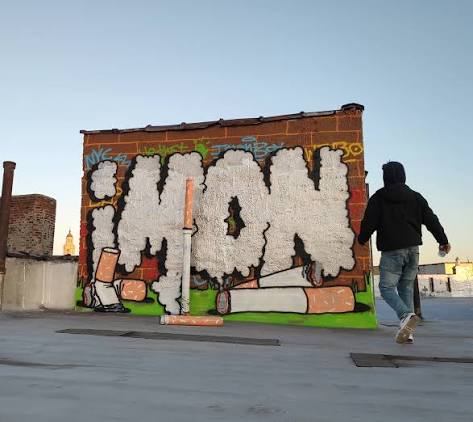
The same approach emerges in her murals, where letters expand into architectural space and interact with the surrounding environment. Here, lettering becomes a visual structure, maintaining the stylistic coherence that runs through all of her work: fluid, accessible, and visually energetic.